01 — The Work
Uber brought me in to execute brand messaging across paid social, LinkedIn, and print — three campaigns, three audiences, one brand system that had to hold up everywhere it landed.
The work spanned an autonomous vehicle policy campaign, a nonprofit partnership story, and a merchant acquisition print ad. Different message, different channel, different reader every time. The job was making all three feel unmistakably Uber without repeating the same layout twice.
02 — Autonomy Campaign
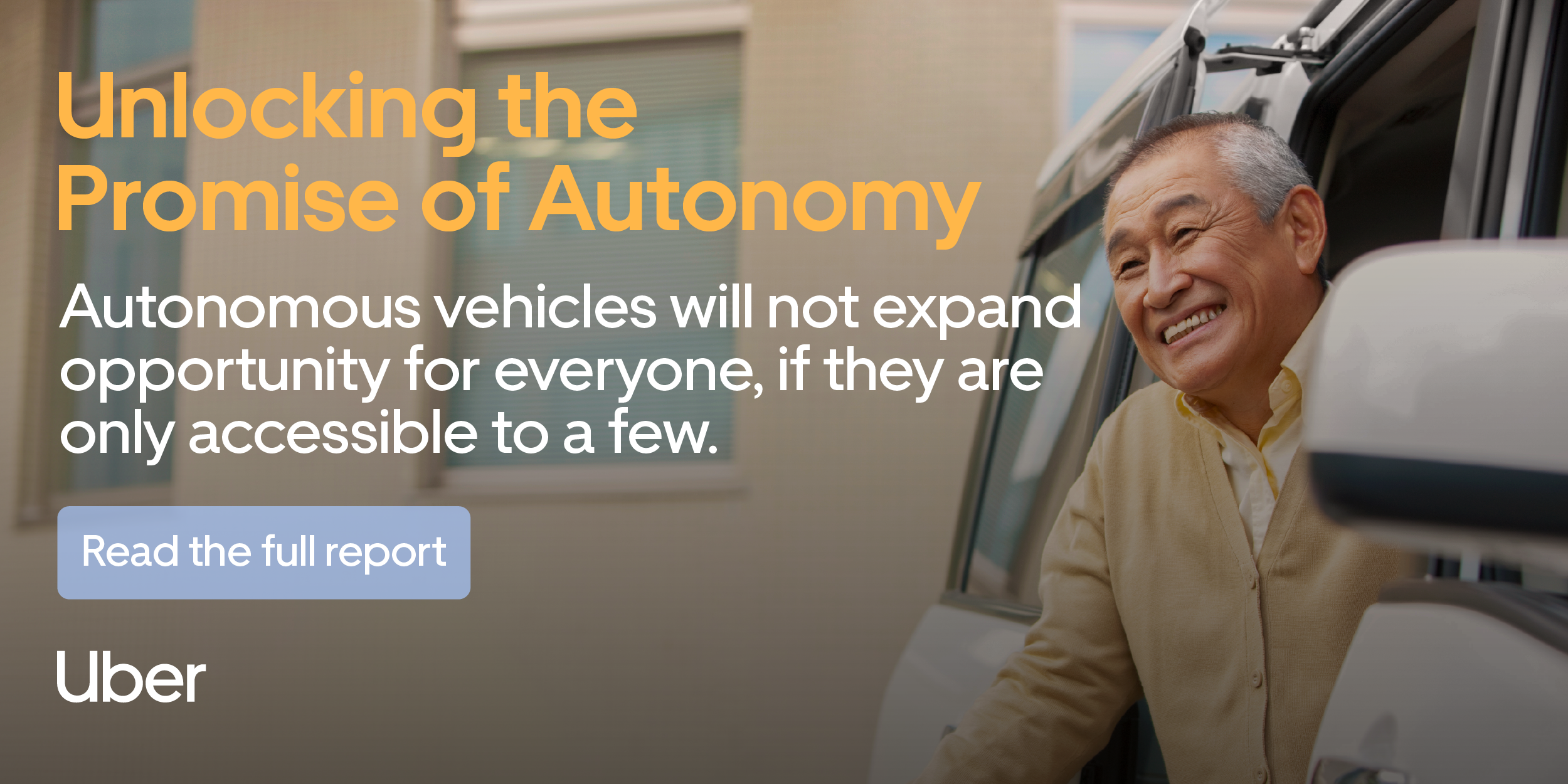
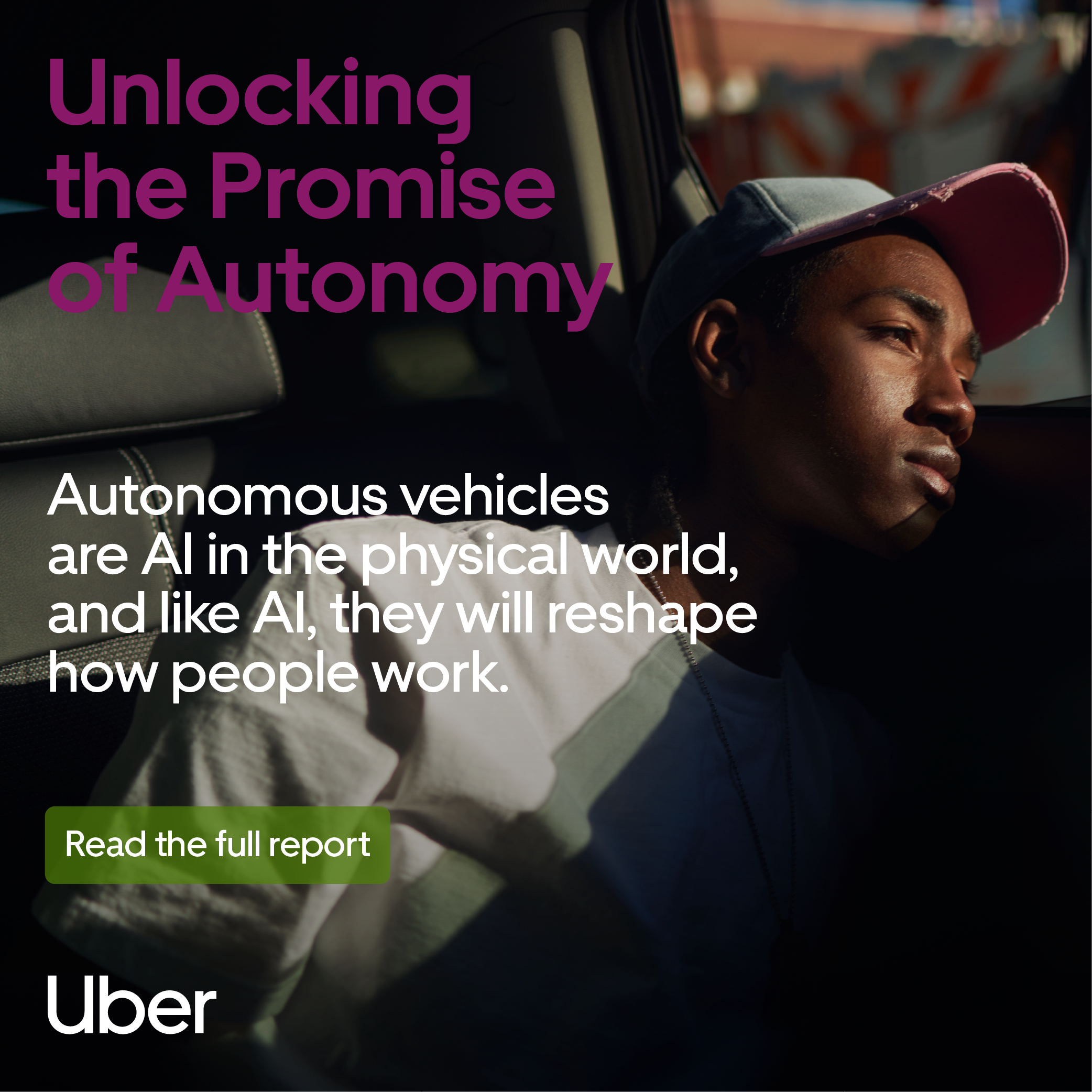
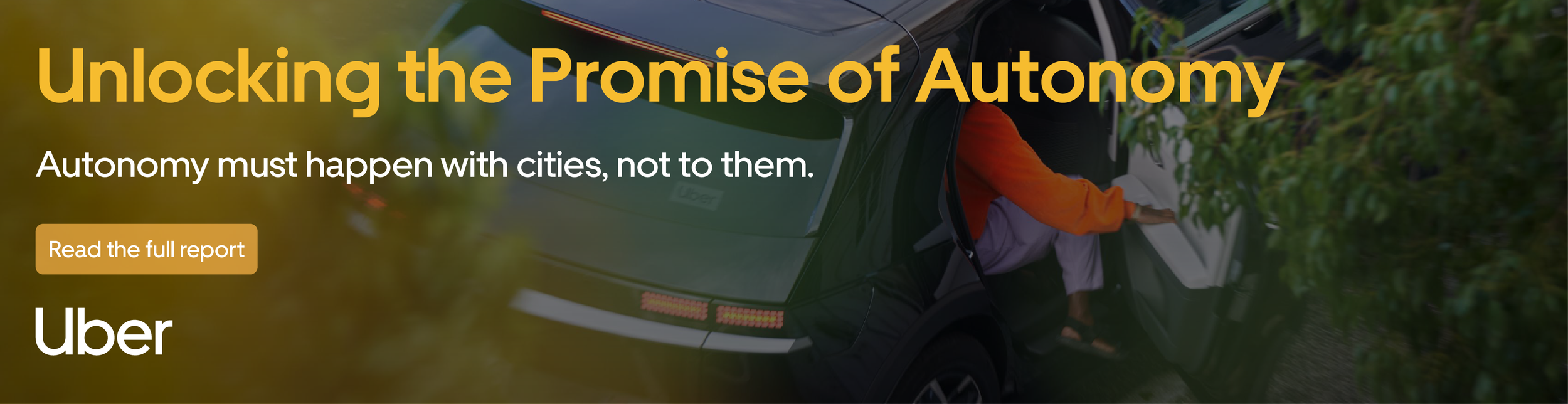
Three executions, three ad units — a 500×500 square for Politico, a 600×300 banner for Greater Greater Washington, a 970×250 leaderboard for GeekWire — each pairing a different stakeholder's quote with a color treatment built for that placement. The policy audience got the "cities, not to them" line. The transit-focused readers got the accessibility quote. Same report, three entry points depending on who was reading.
The color-per-quote approach kept each placement visually distinct against its host site, while a consistent type treatment, quote-mark motif, and CTA button held the whole thing together as one campaign no matter where it ran.
03 — Hope Rides (LinkedIn Carousel)
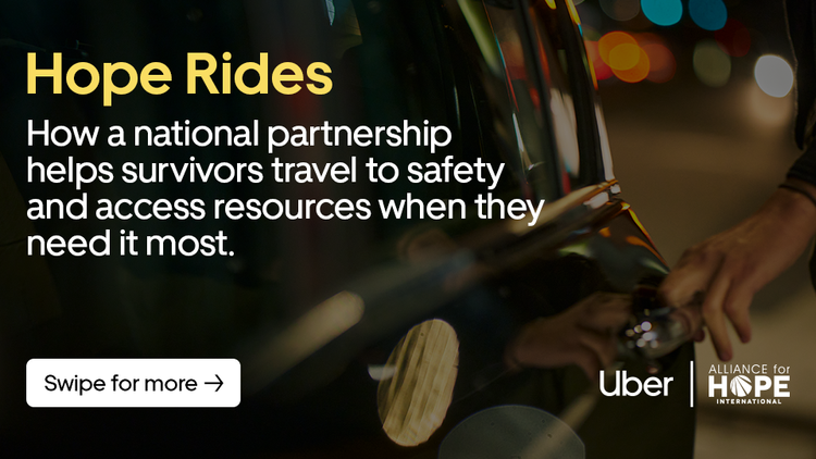
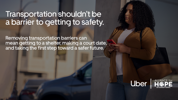
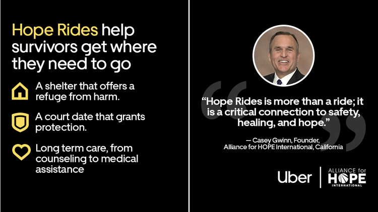
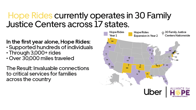
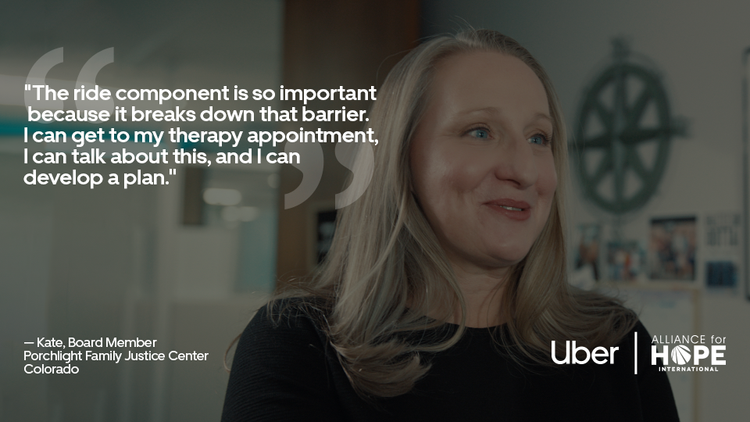
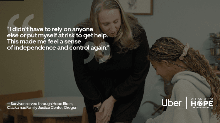
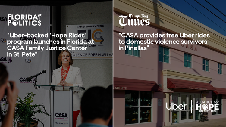
A LinkedIn carousel built around Uber's Hope Rides program — a partnership with Alliance for HOPE International that gives domestic violence survivors free rides to shelters, court dates, and long-term care. Six slides, paced to earn a swipe: open on the human stakes, land the data (30 Family Justice Centers, 3,000+ rides, 30,000+ miles), close on third-party proof via press coverage.
The challenge with carousel work is pacing — every slide has to justify the next tap. Stats slides needed to feel as urgent as the testimonial slides, not like a break in the story.
swipe
04 — Nebraska Merchant (Print)
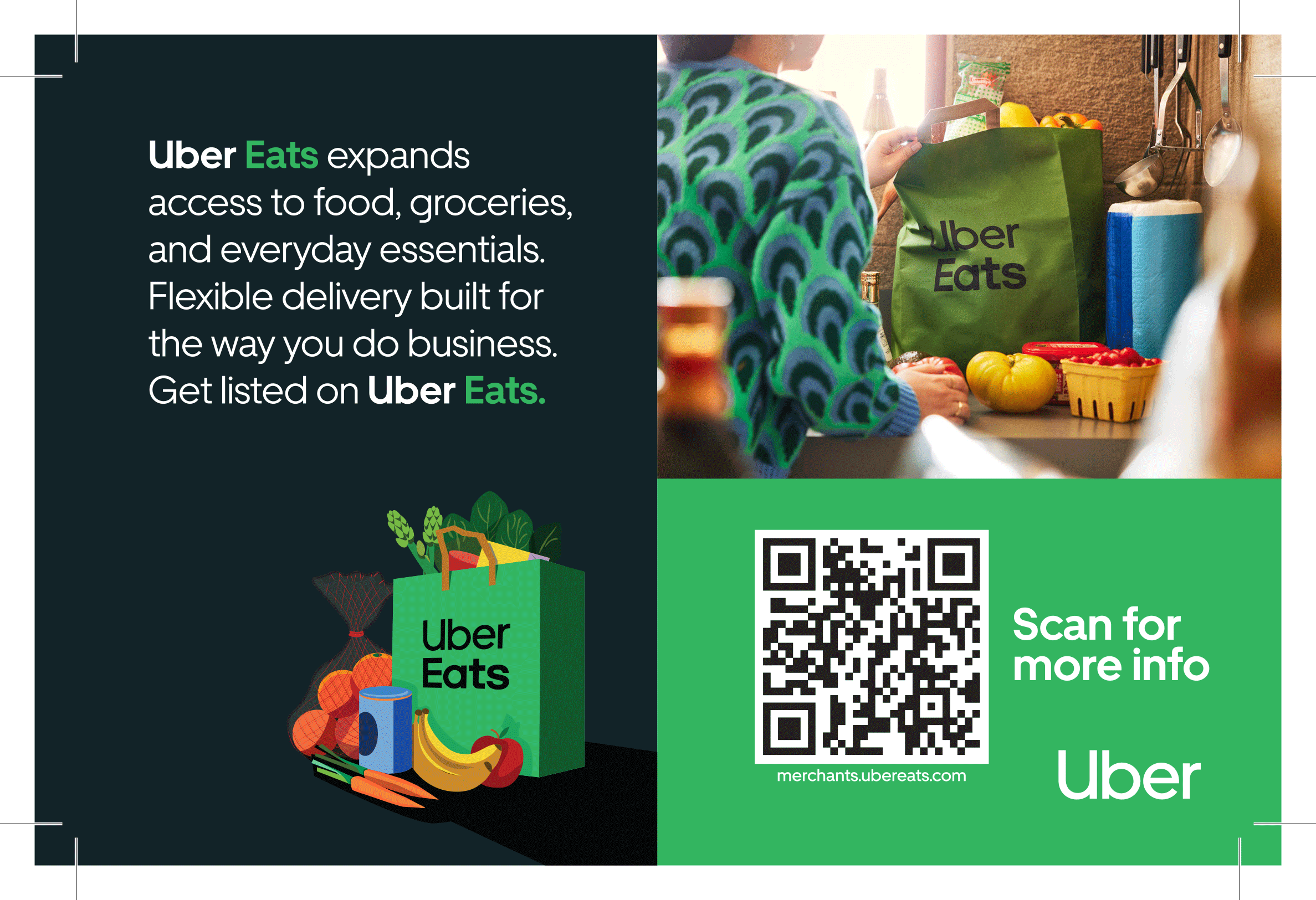
A half-page print ad aimed at local merchants — grocery stores, restaurants, small retailers — encouraging them to list on Uber Eats. No scroll, no swipe, no motion to lean on. Just a QR code, a clear value prop, and a layout that reads clean at half-page size in a local trade publication.
Digital-first brands often go stiff the moment you take away the screen. This kept Uber Eats' color and iconography intact while working within print's fixed, one-shot constraints.