THE CHALLENGE
Security brands often rely on predictable visuals such as shields and badges. The challenge was to design a mark that feels powerful without looking outdated or generic.
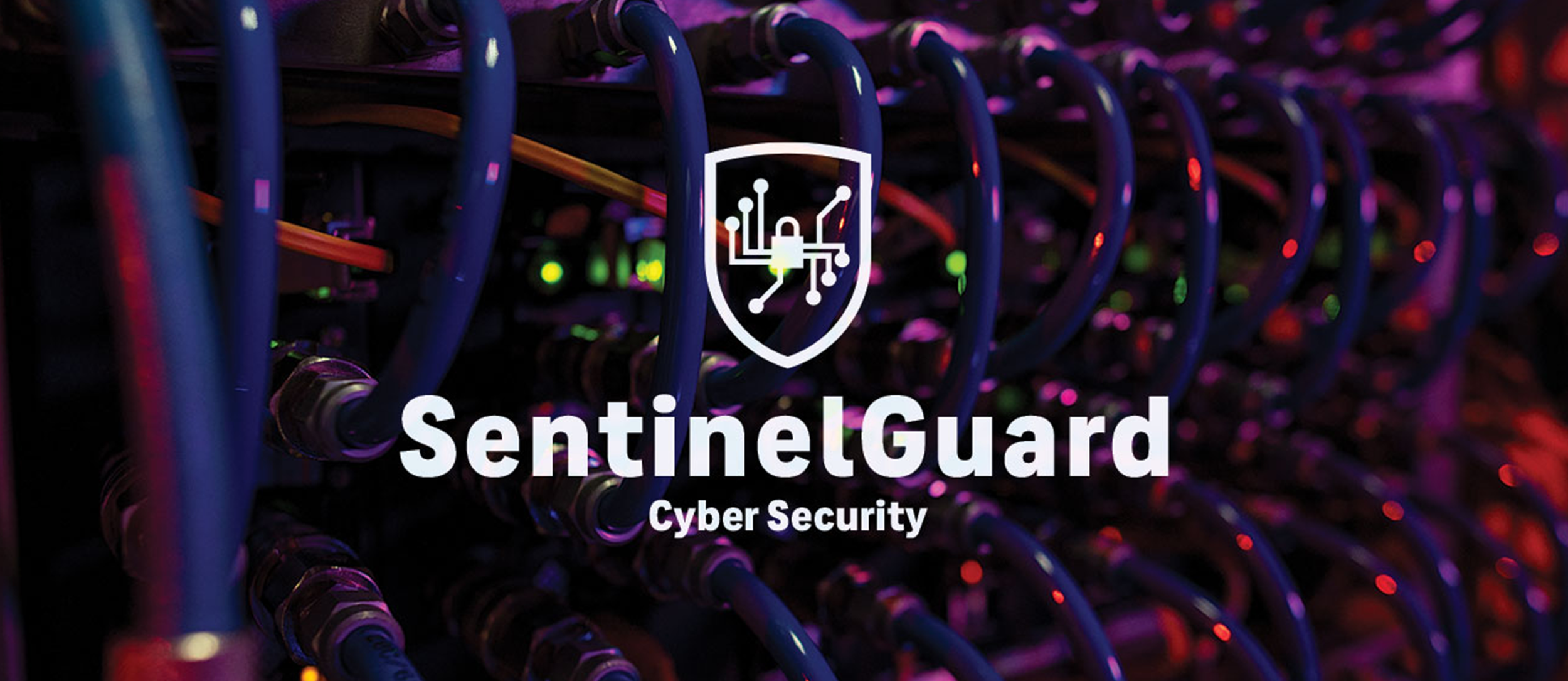
LOGO DEVELOPMENT
The logo uses strong geometric forms to create a symbol that suggests protection and structure while remaining clean and contemporary.

The Mission
Security brands often rely on predictable symbols such as shields, badges, and crests. The challenge was to create a mark that feels strong and trustworthy while maintaining a clean and contemporary style.
BRAND SYSTEM
The identity uses a high-contrast color palette and strong typography to create a consistent visual language. The system was designed to work across digital, print, and environmental applications.

Real World Applications
The brand was developed to work across corporate materials, marketing assets, and physical applications. The visual system maintains a strong presence in both digital and real-world environments.
Conclusion
The final identity gives Sentinel Guard a modern and authoritative brand presence. The system is bold, scalable, and designed to communicate strength and reliability across all touchpoints.