

The Objective
Logistics and transportation brands often rely on generic symbols and dated typography, which can make it difficult to stand out in a highly competitive B2B space. The objective was to create a visual identity that feels modern and technical while still communicating the reliability and credibility expected from a logistics provider. The direction focused on structure, precision, and strong typography to support a brand built around efficiency and trust.

The Brief
FreightFirst required a contemporary brand identity capable of scaling across digital platforms, marketing materials, and corporate communications. The visual system needed to feel stable and professional while also reflecting speed, organization, and forward-thinking technology. The goal was to develop an identity that could function across both operational materials and brand-facing applications without losing clarity or consistency.
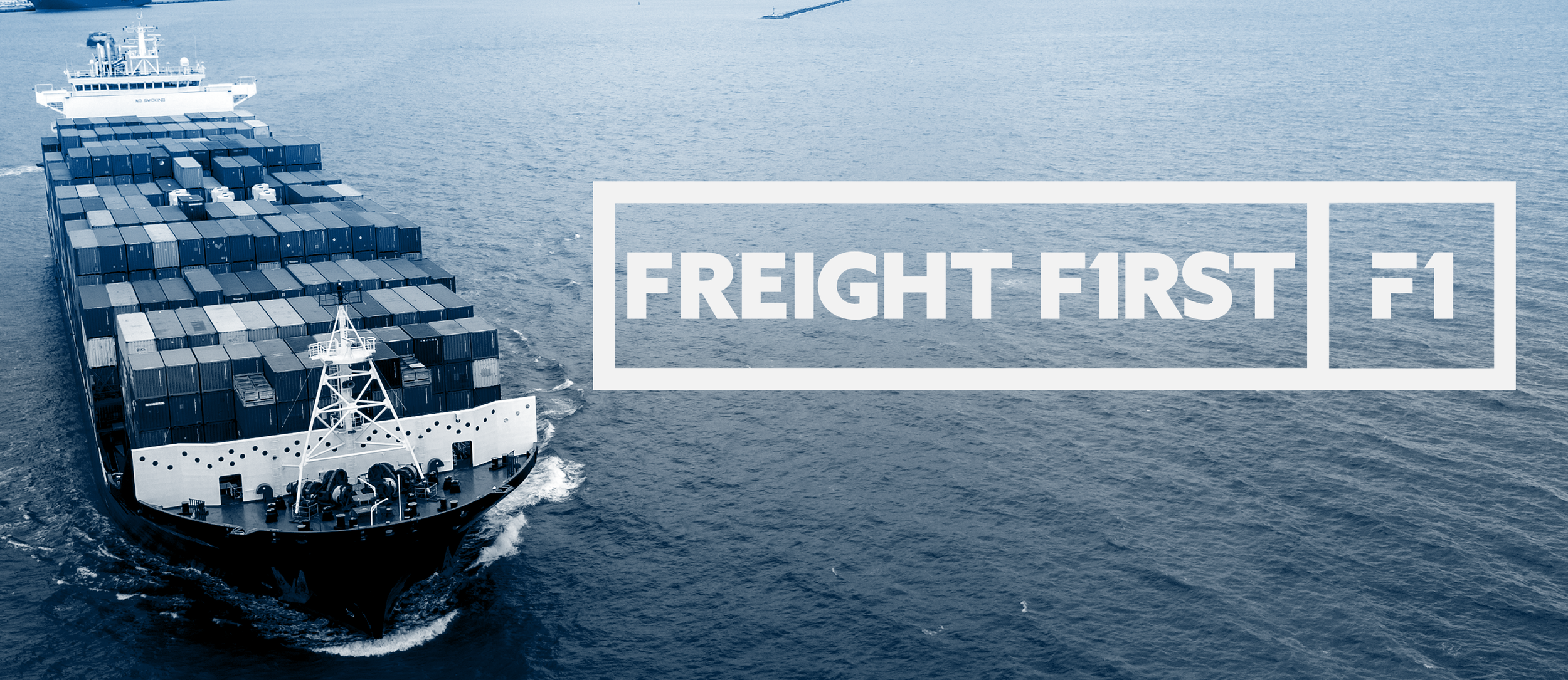
LOGO DEVELOPMENT
The logo was constructed using bold geometric letterforms designed to suggest movement, direction, and efficiency. Rather than relying on literal transportation imagery, the mark uses typography and structure to create a clean and confident presence. Careful attention was given to proportion, spacing, and alignment to ensure the logo remains legible and recognizable across digital interfaces, printed materials, and environmental graphics.
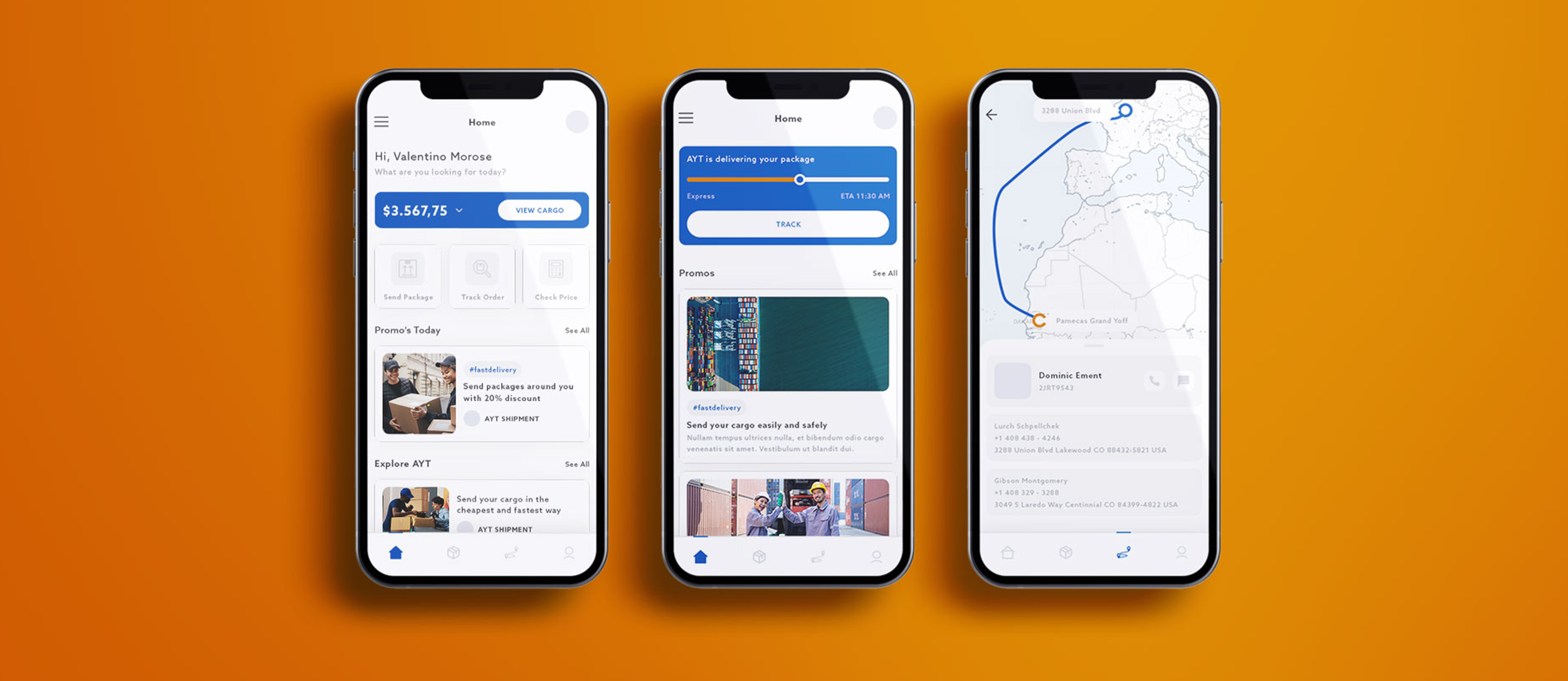
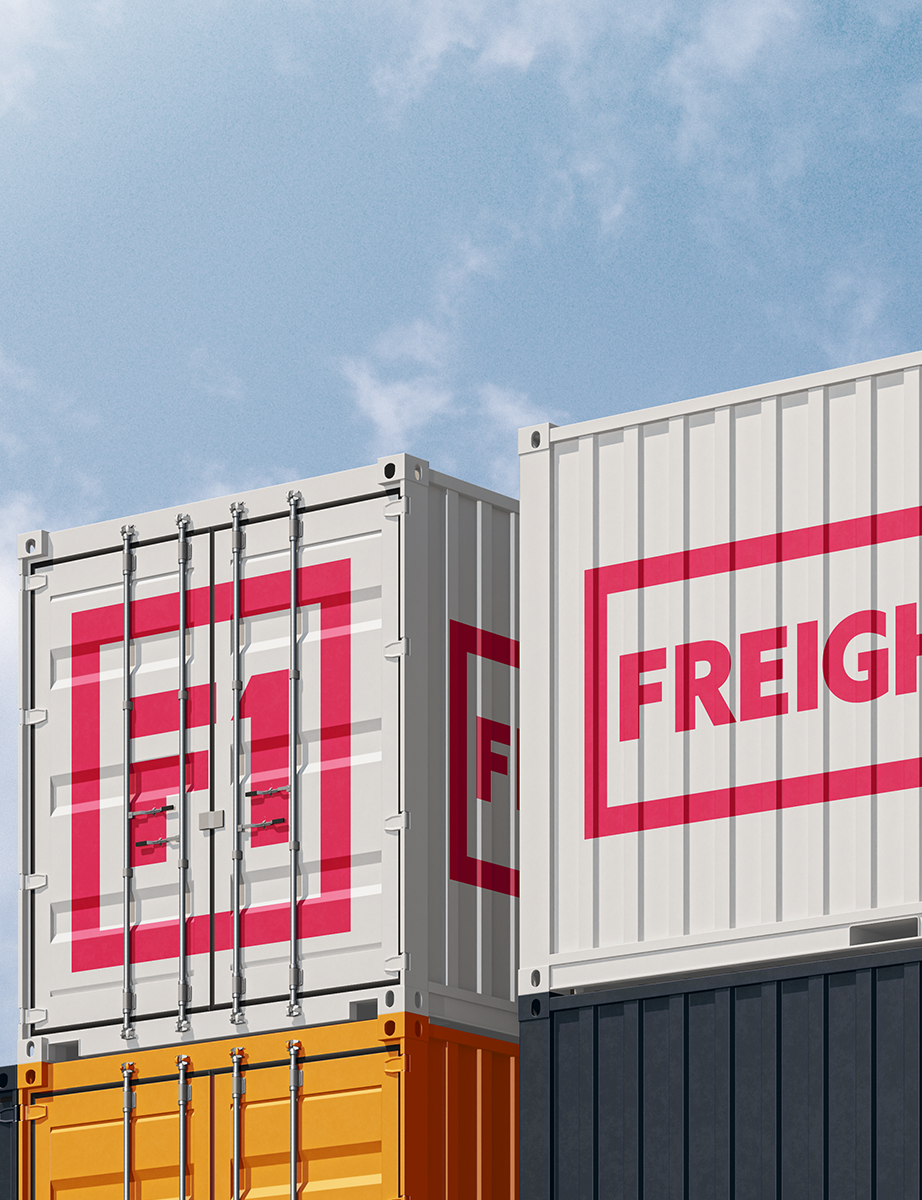
Brand Applications
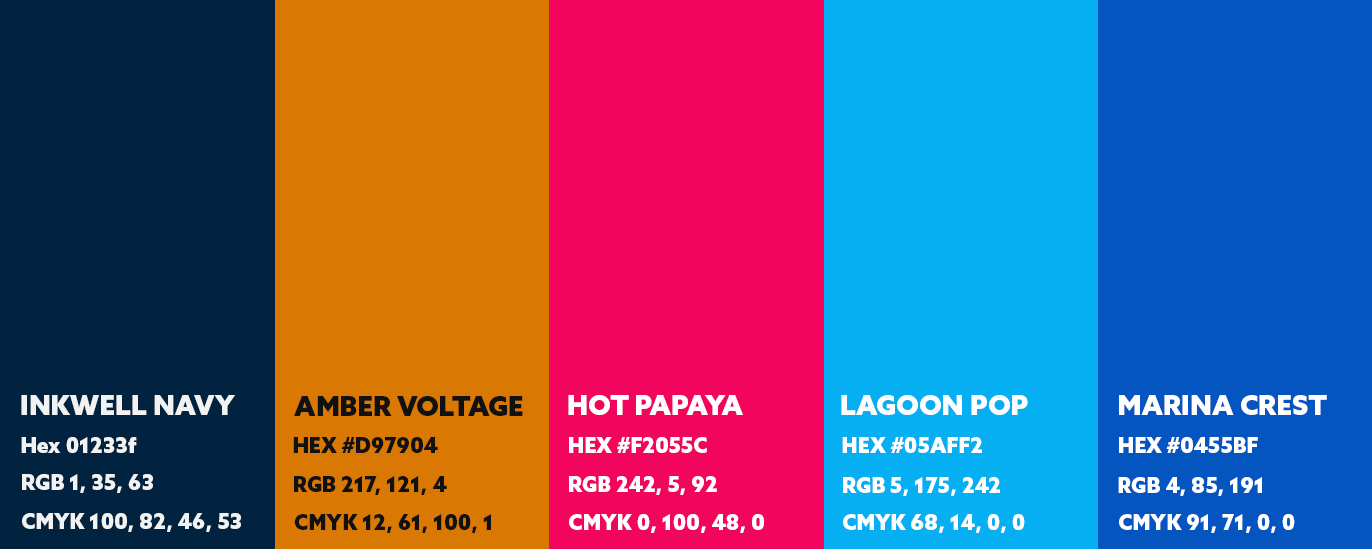
The identity was built as a flexible system that can adapt across multiple formats while maintaining a consistent visual language. A limited color palette, strong typography, and grid-based layouts reinforce clarity and organization, supporting the functional needs of a logistics brand. The system was designed to work across print, digital, and presentation materials, allowing the brand to remain cohesive across both internal and external communications.
Visual System
The brand relies on bold typography, high-contrast color, and geometric structure to create a visual language that feels precise and dependable.
This approach ensures the identity remains clear and recognizable across marketing assets, corporate documents, and large-scale applications.


Final Execution
The final identity positions FreightFirst as a modern and dependable logistics brand with a clean, scalable visual system. The design balances technical precision with contemporary styling, creating a brand that feels established, efficient, and built for long-term growth across both digital and print environments.