

The Brief
Consulting and advisory firms often rely on traditional visual styles that can feel dated or overly conservative. The goal was to develop a visual identity that feels sophisticated and contemporary while maintaining the credibility and professionalism expected within a corporate consulting environment. The direction focused on clarity, restraint, and strong typography to create a brand that communicates expertise without feeling rigid or outdated.

About the Project
Field Office Advisory was positioned as a modern consulting practice built on structure, strategy, and clear communication. The identity was designed to reflect these qualities through disciplined typography, intentional spacing, and a restrained color palette that supports a polished and professional presence. Every element of the brand was developed to feel confident, organized, and adaptable across both digital and print communications.
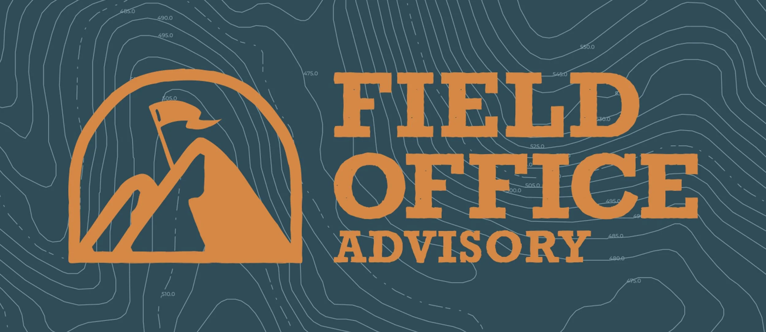
LOGO DEVELOPMENT
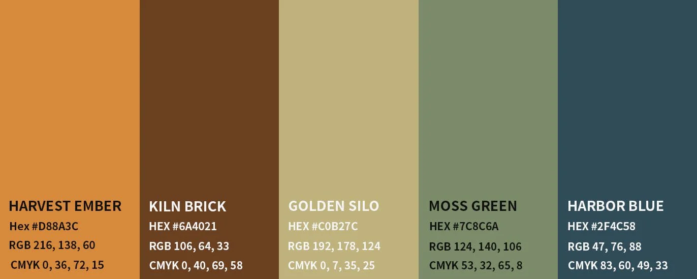
Design System
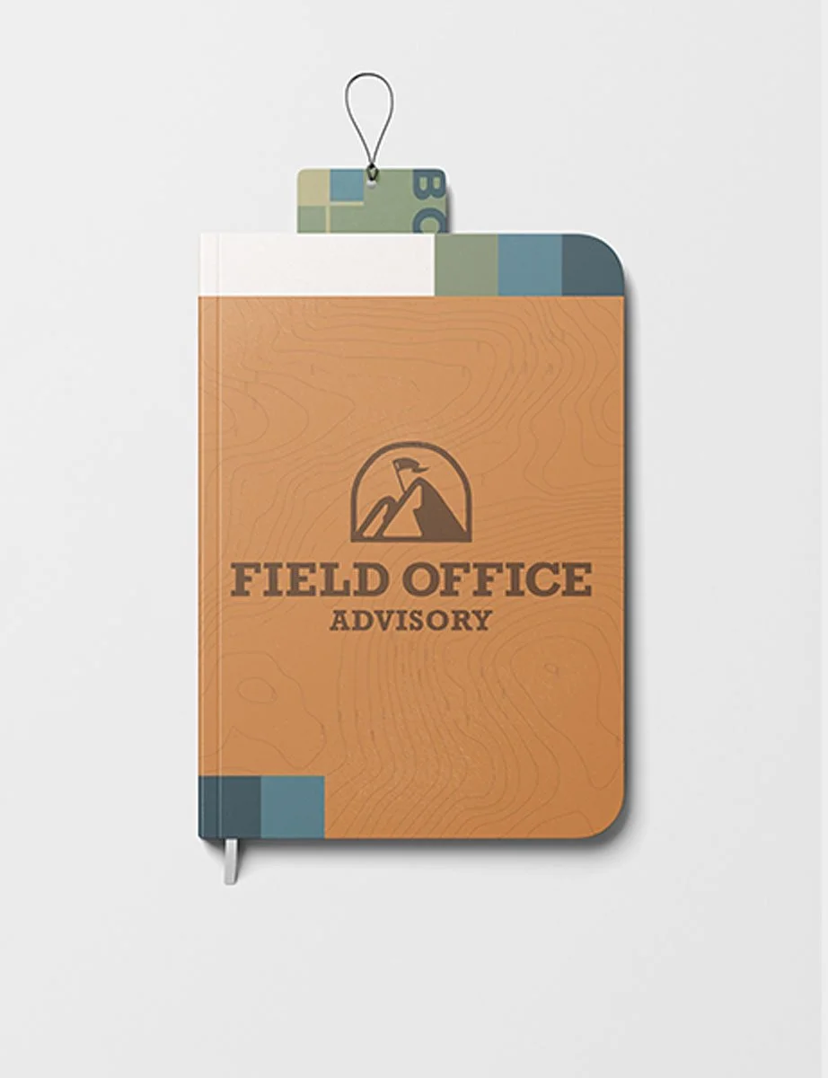
The identity was developed as a flexible, typography-driven system that can scale across corporate communications, marketing materials, and internal documentation. Neutral tones combined with strong, structured type create a consistent visual language that reinforces professionalism while still feeling modern. The system was built to support real-world consulting materials, including slide decks, reports, proposals, and digital content.
The logo was designed using clean typography and carefully balanced spacing to create a mark that feels stable, precise, and authoritative. Rather than relying on decorative elements, the focus was placed on proportion, alignment, and readability to achieve a refined and timeless result. The simplicity of the mark allows it to function effectively across presentations, documents, and digital platforms without losing clarity.
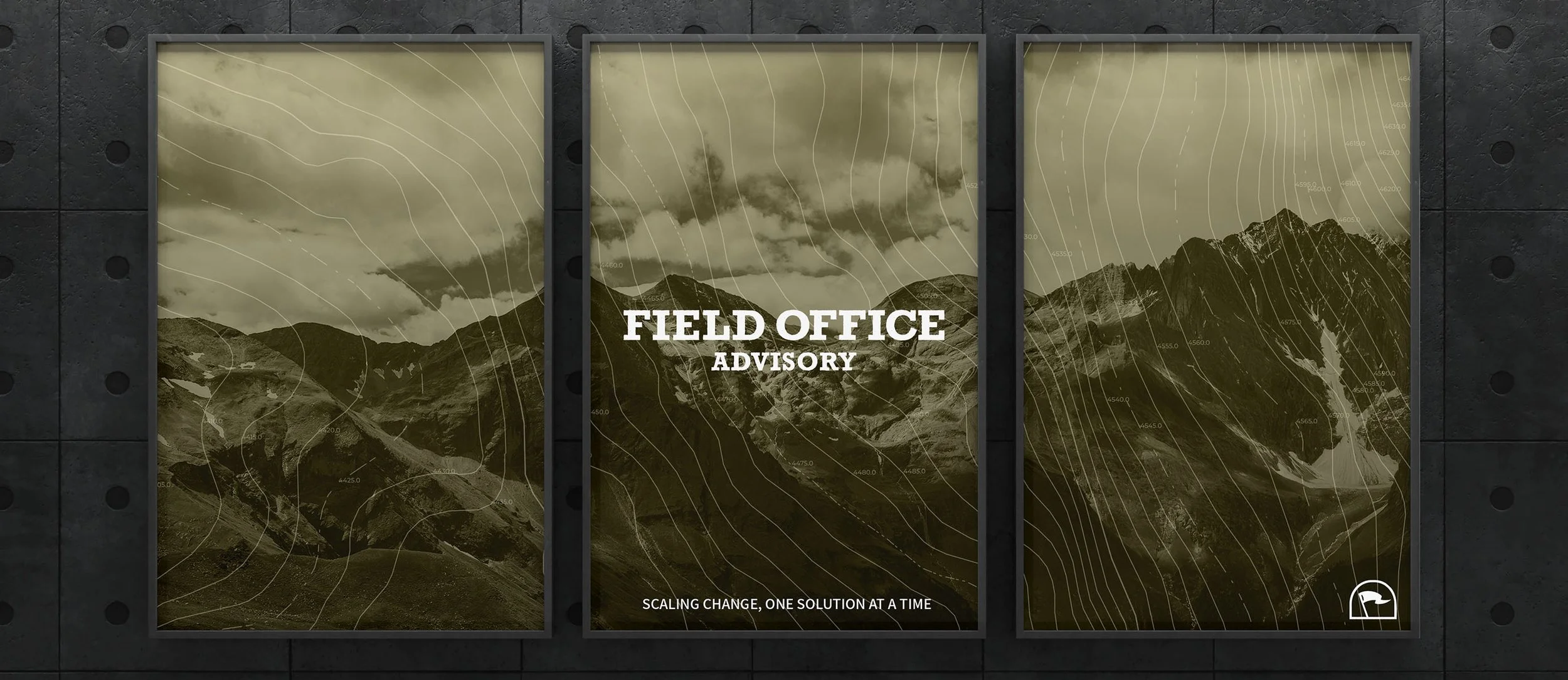
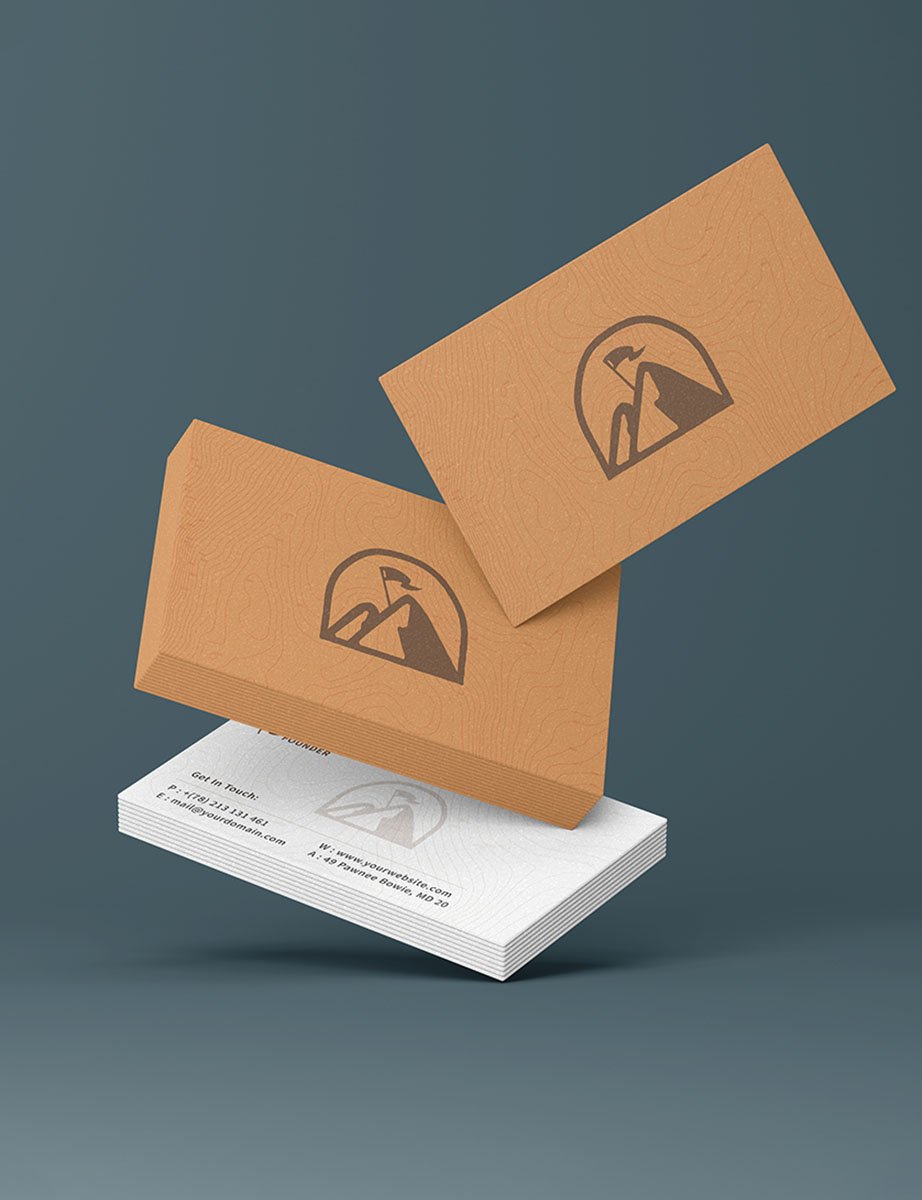
APPLICATIONS
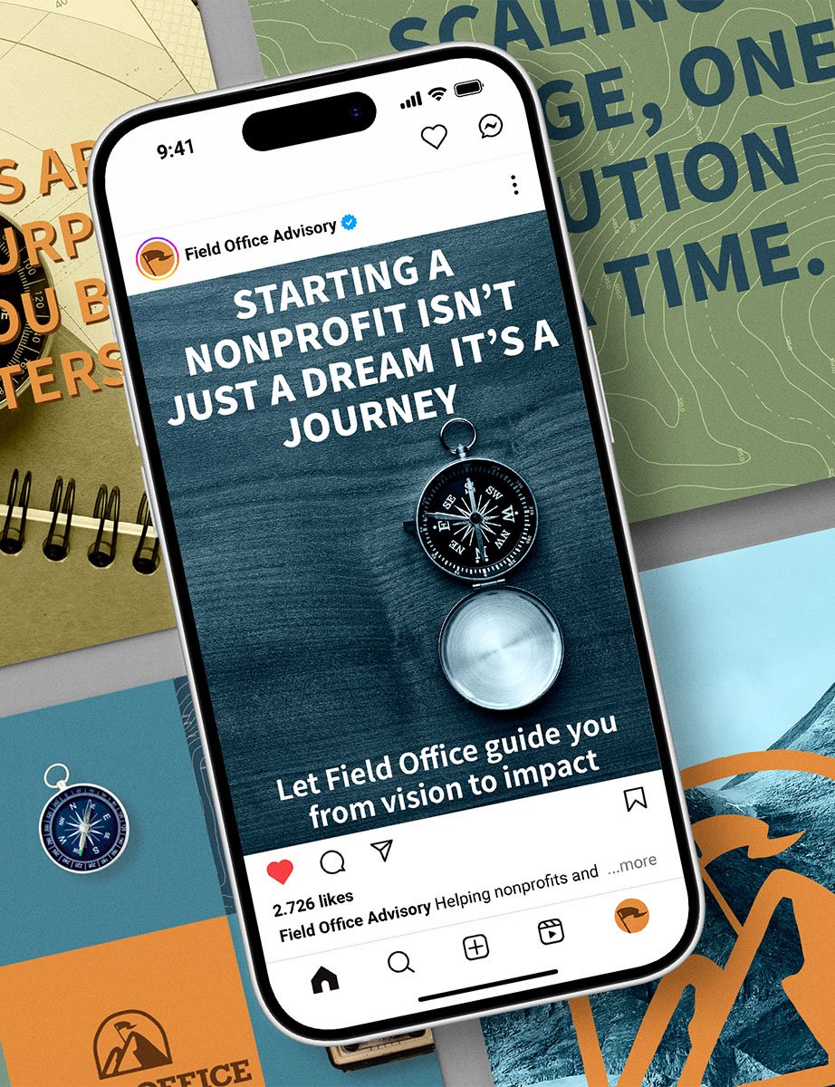
The brand was designed to function across a wide range of corporate touchpoints, including presentations, reports, marketing collateral, and digital assets. Layouts emphasize hierarchy, spacing, and readability to ensure information remains clear and organized regardless of format. This approach allows the identity to remain consistent while adapting to different communication needs.
Result
The final identity positions Field Office Advisory as a modern consulting brand with a refined and highly functional visual system. The combination of strong typography, restrained color, and structured layouts creates a professional presence that feels contemporary, credible, and built for long-term use.