NEOBANK
A speculative identity for a digital-first bank built on trust without the corporate weight.
scroll

01 — the brief
Self-initiated concept. The ask I gave myself: design a bank that feels built for people who've never set foot in a branch. Digital-native, fast, and human, without borrowing the cold minimalism most fintech brands default to.
Audience: early-career professionals opening their first "serious" account. They want competence, not a lecture on innovation.
02 - THE ANGLE
Most neobank branding chases one of two moves: sterile minimalism or forced friendliness. Neither earns trust. They just avoid looking untrustworthy. The angle here: warmth through precision. Every part of the system, mark, palette, and type, had to feel deliberate, not decorated.

03 - IDENTITY SYSTEM
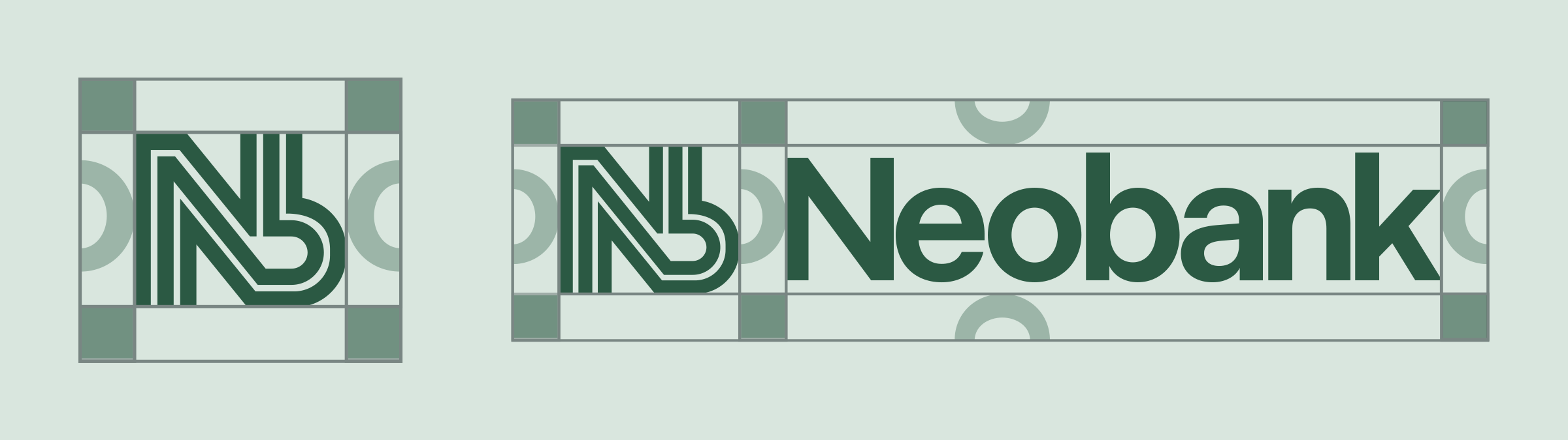
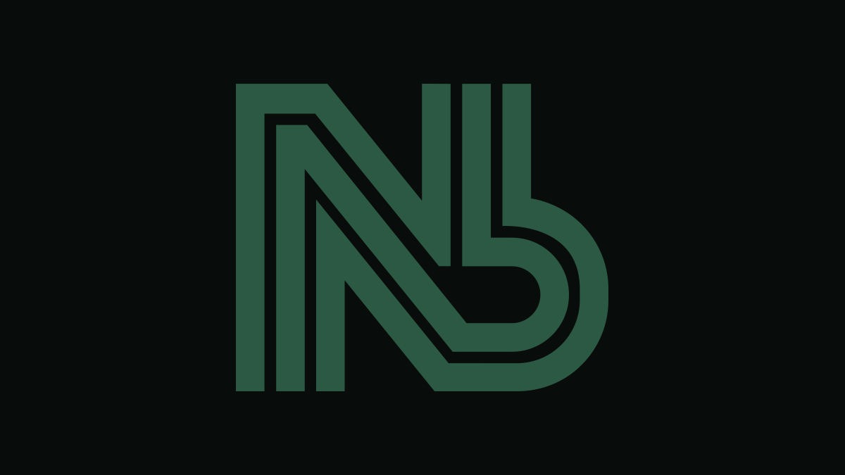
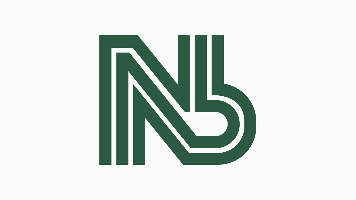
The mark fuses N and B into a single monogram. The N's final stroke becomes the B's bowl, so the two letters share one continuous line instead of sitting side by side. That construction is the whole thesis: nothing arbitrary, nothing decorative, which matters more in banking than almost any other category.

04 - brand system
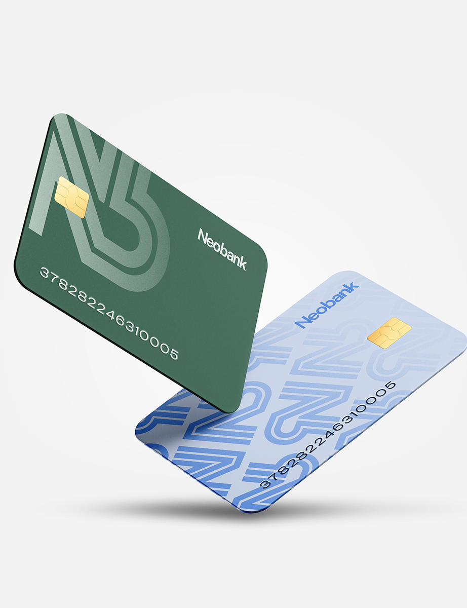
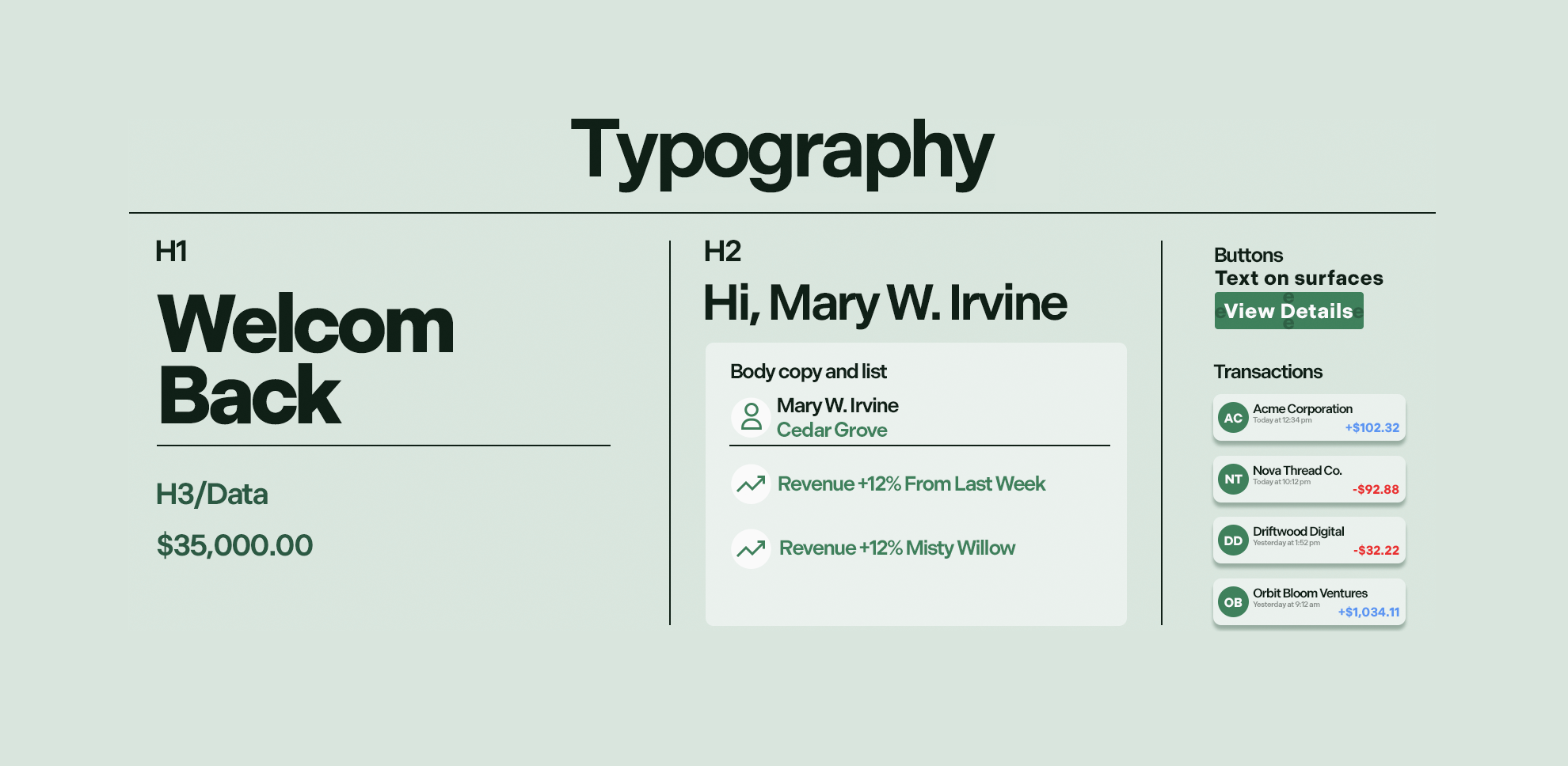
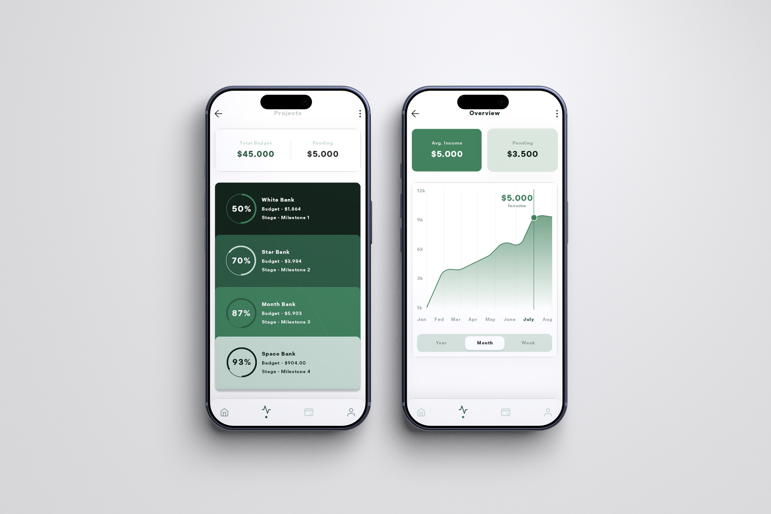
Color breaks from fintech's usual blue-and-white sterility. A palette built on forest greens, Blackwood Pine, Hunter's Cloak, and Cedar Grove, reads grounded and trustworthy instead of clinical, with Cornflower Sky as the one cool accent that keeps it from tipping into "eco-brand" territory. Naming each swatch, not just hex codes, is part of the system. It gives the palette a point of view before it even hits a screen.
Type pairs a bold, rounded display face for headlines with a cleaner functional sans for UI and data. The rounded face carries the warmth. The second one carries the precision. The same split the whole identity is built on.
05 -APPLICATION
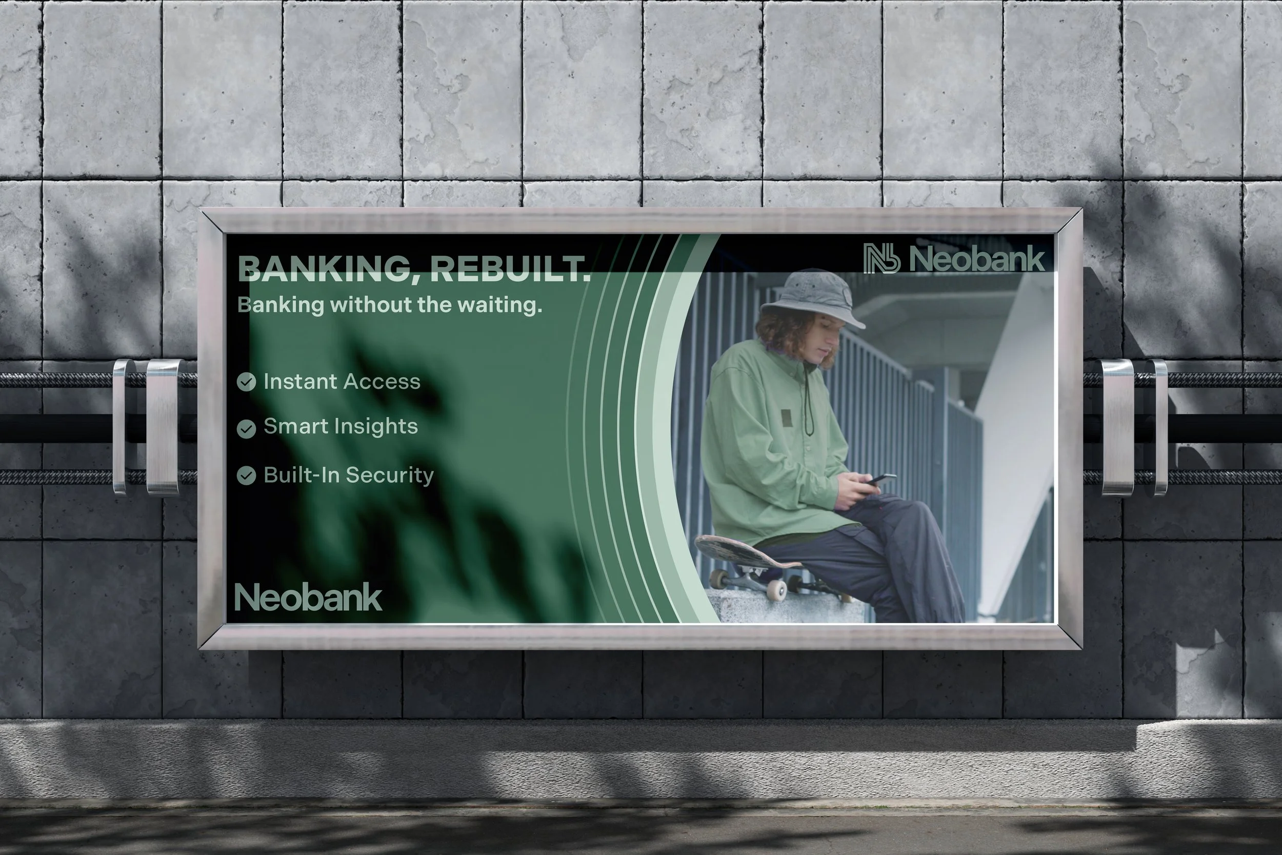
The billboard puts the palette to work at scale. The wave motif pulls directly from the color system, and real lifestyle photography, not stock finance imagery, keeps the "everyday, not corporate" positioning intact even at outdoor scale.
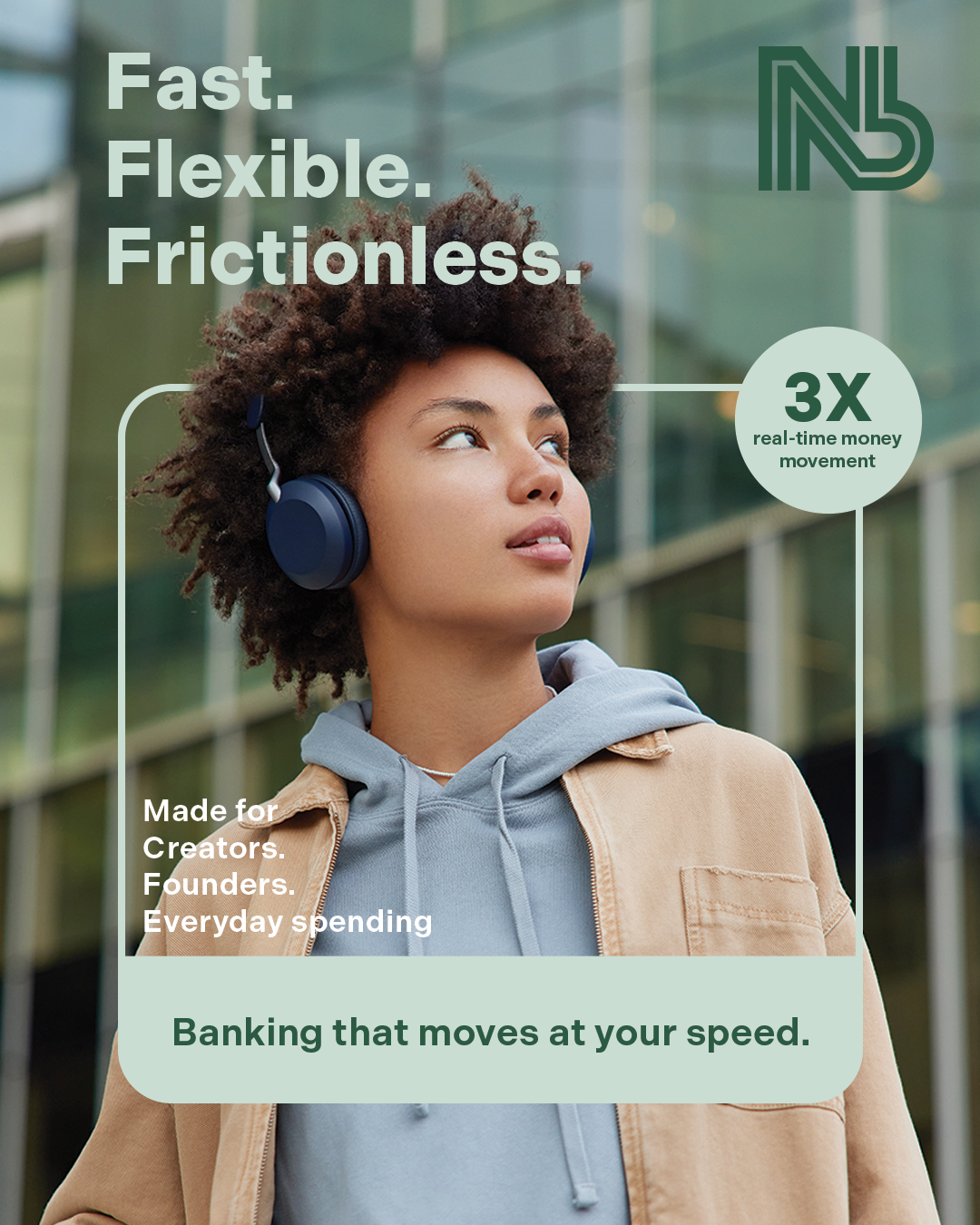
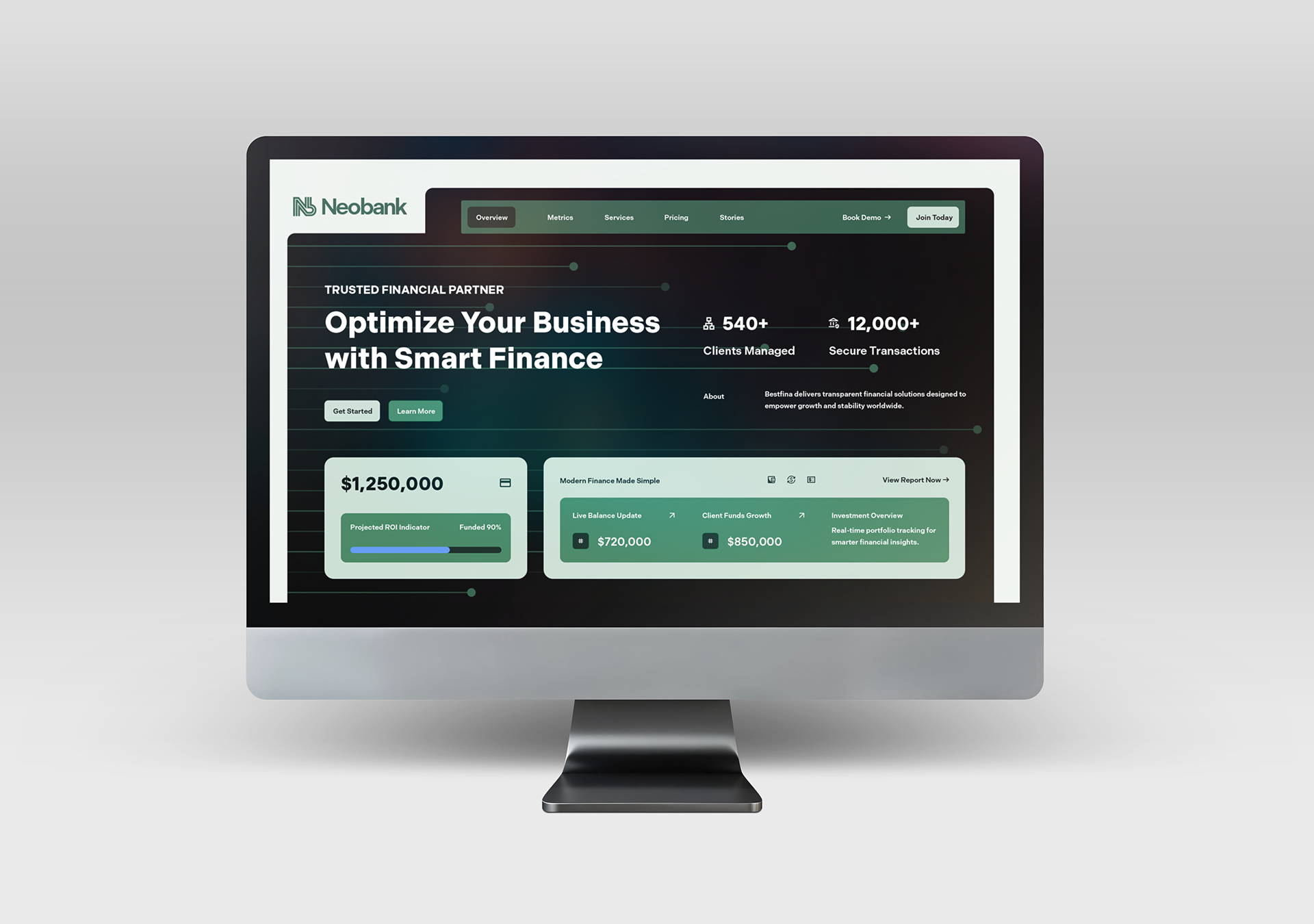
The social ad leans harder into that: bold three-line copy ("Fast. Flexible. Frictionless."), a stat callout instead of a feature list, and a soft card-style CTA that echoes the UI's own rounded surfaces. The ad is styled like the product, not like an ad for the product.
06 -OUTCOME
Neobank isn't about proving I can design a fintech logo. It's a working example of building a full identity system from a self-authored strategic problem, not just a creative brief handed to me.