Freight First
scroll
Logistics brands often rely on generic symbols and outdated typography. The challenge was to create a visual identity that feels modern and technical while maintaining the credibility expected in a B2B industry.
The Objective
The Brief
FreightFirst required a modern brand identity that could scale across digital platforms, marketing materials, and corporate applications. The visual system needed to communicate stability and professionalism while feeling contemporary and forward-thinking.
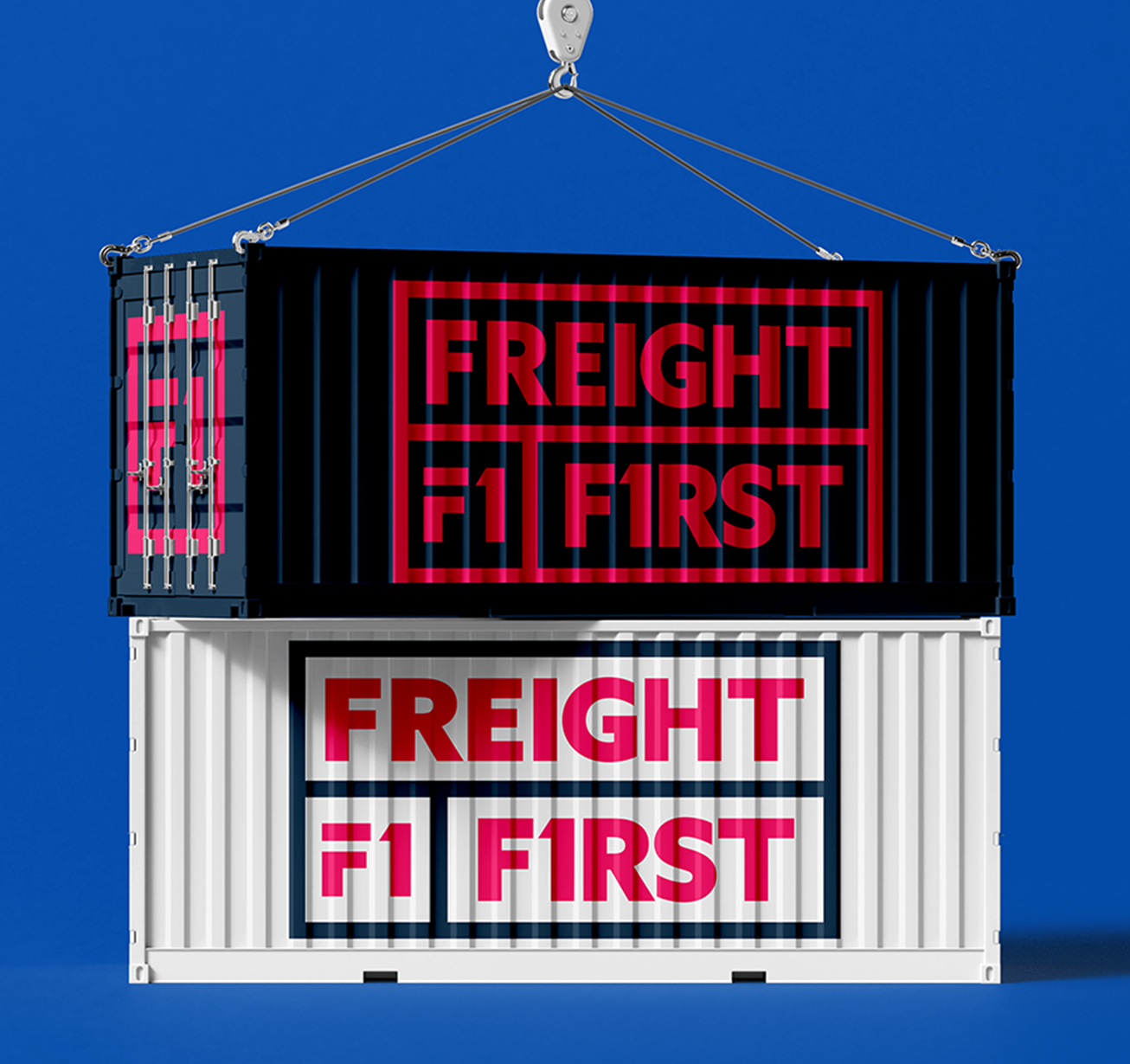
LOGO DEVELOPMENT
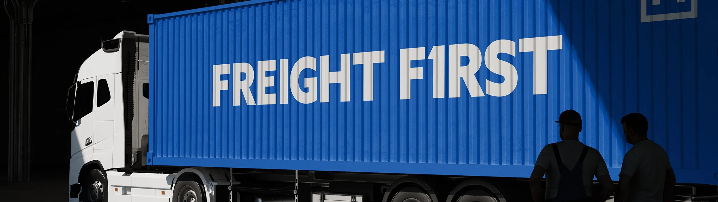
The logo was designed using bold geometric letterforms to suggest movement and efficiency. The mark avoids literal imagery and instead relies on typography and structure to create a clean, confident identity.
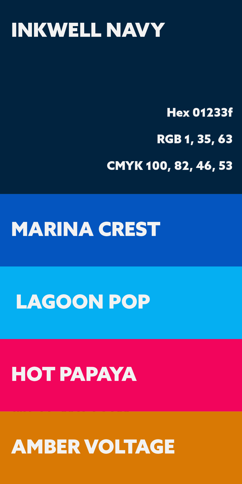
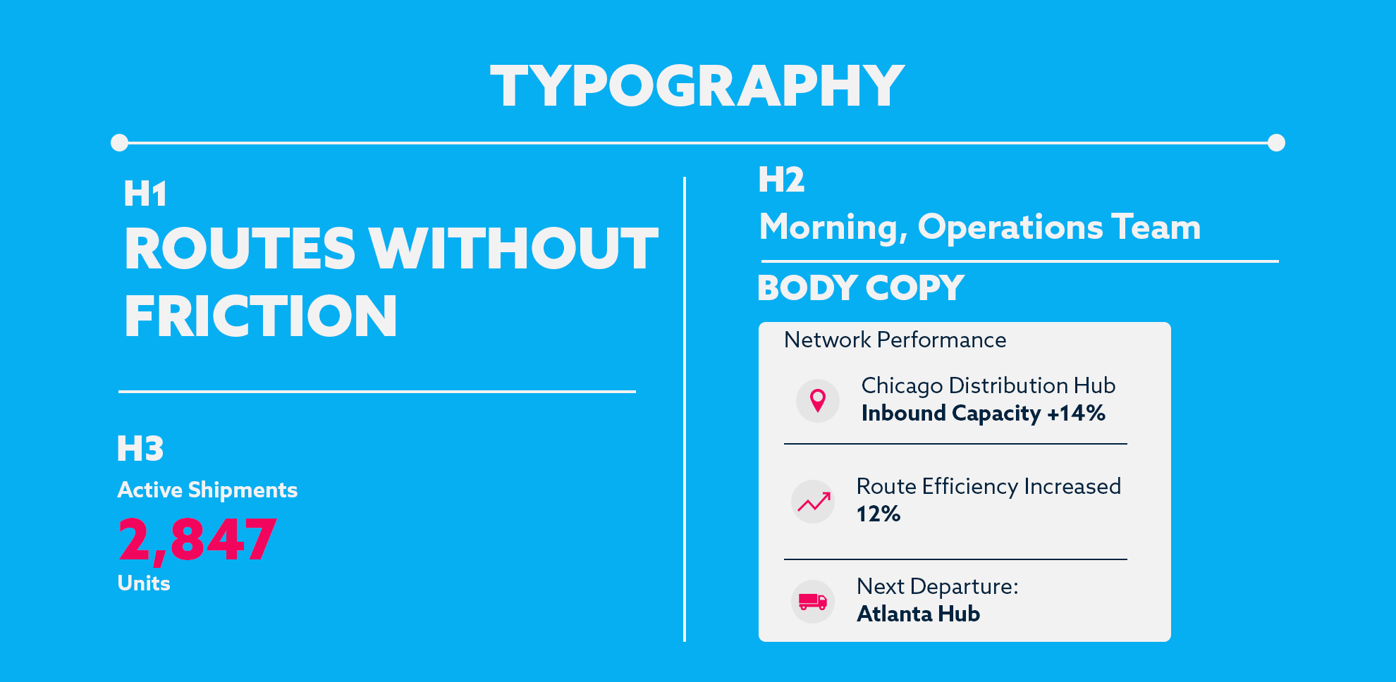
The identity was built using bold typography, high contrast color, and geometric forms to create a consistent visual language across print, digital, and environmental applications.
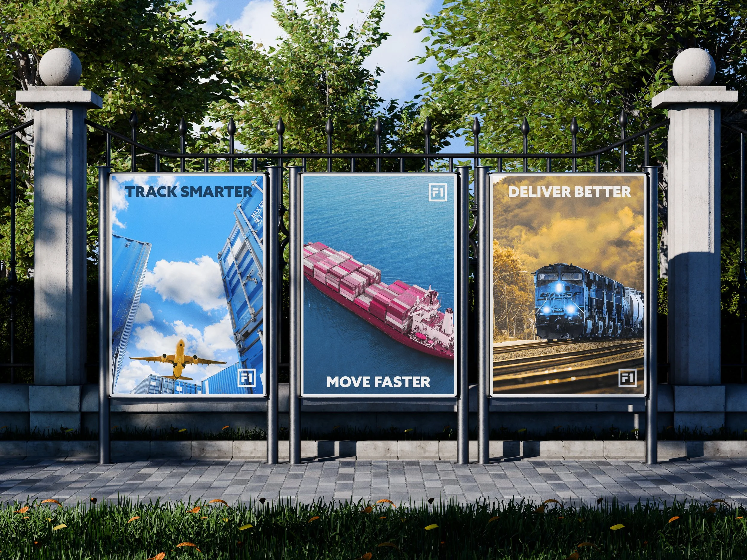
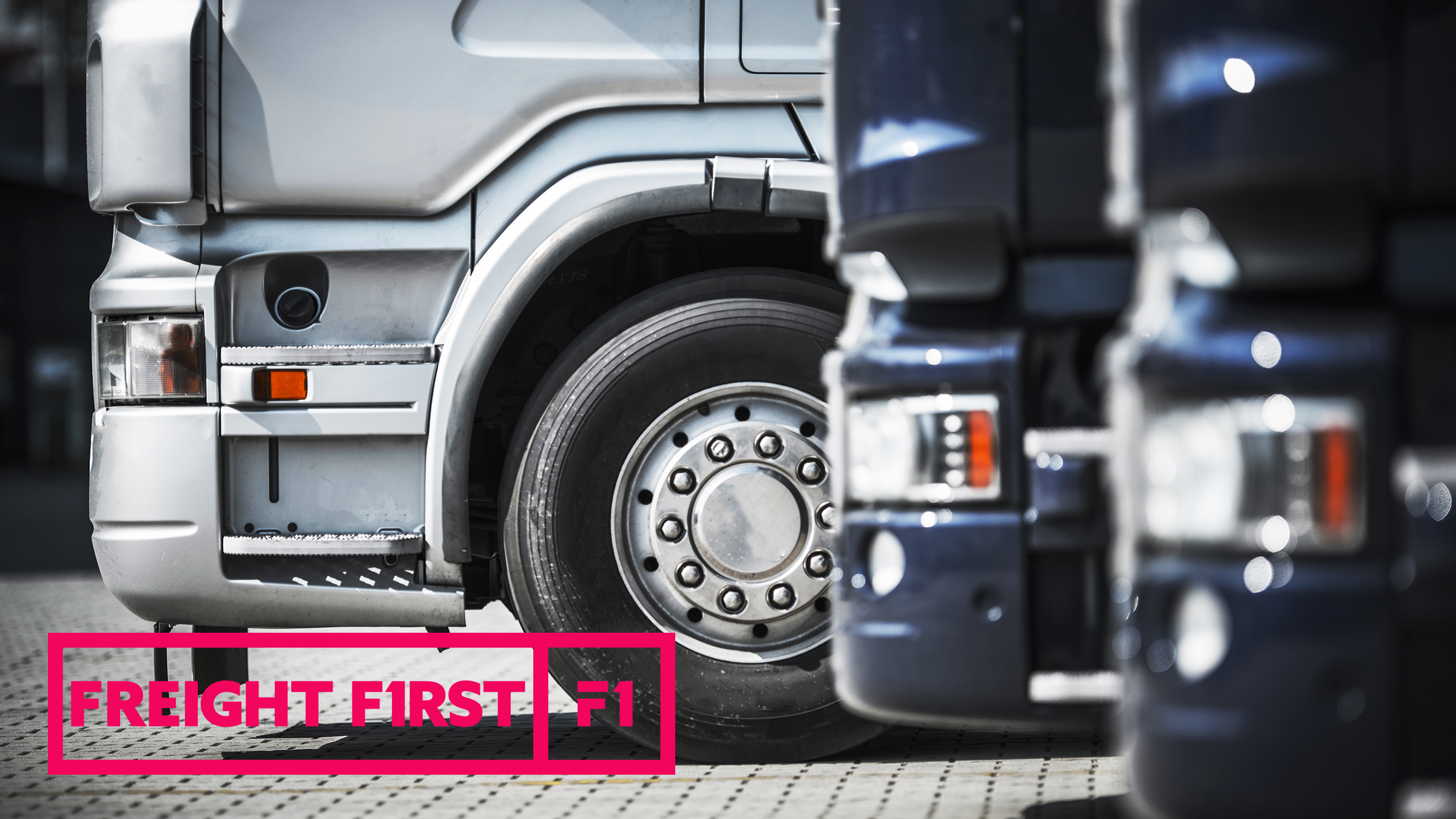
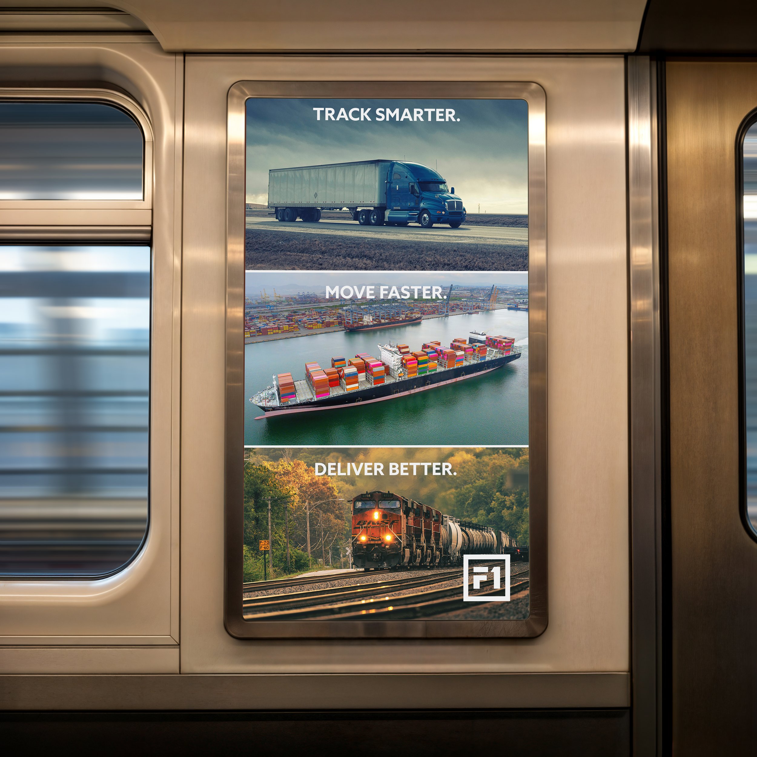
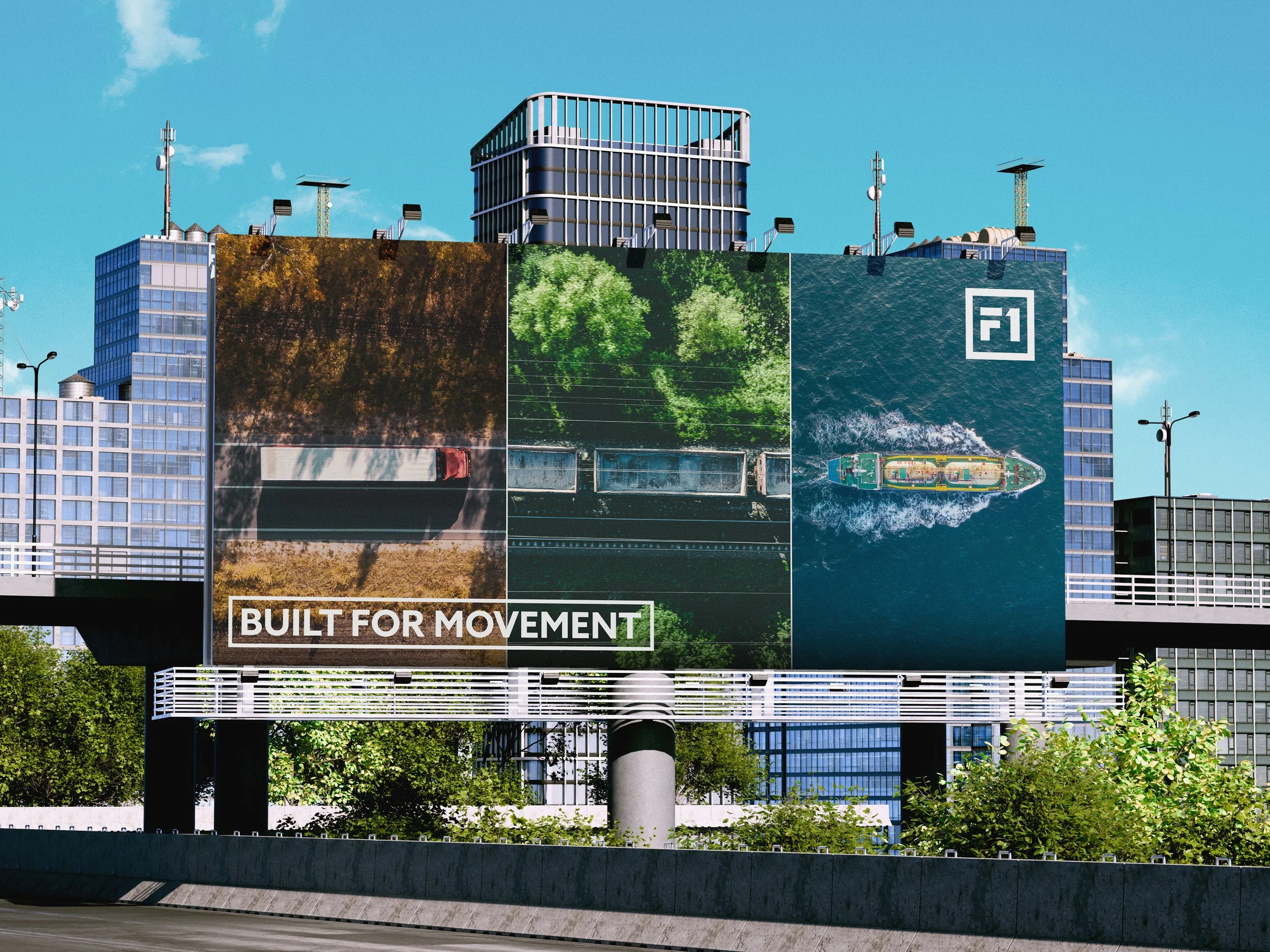
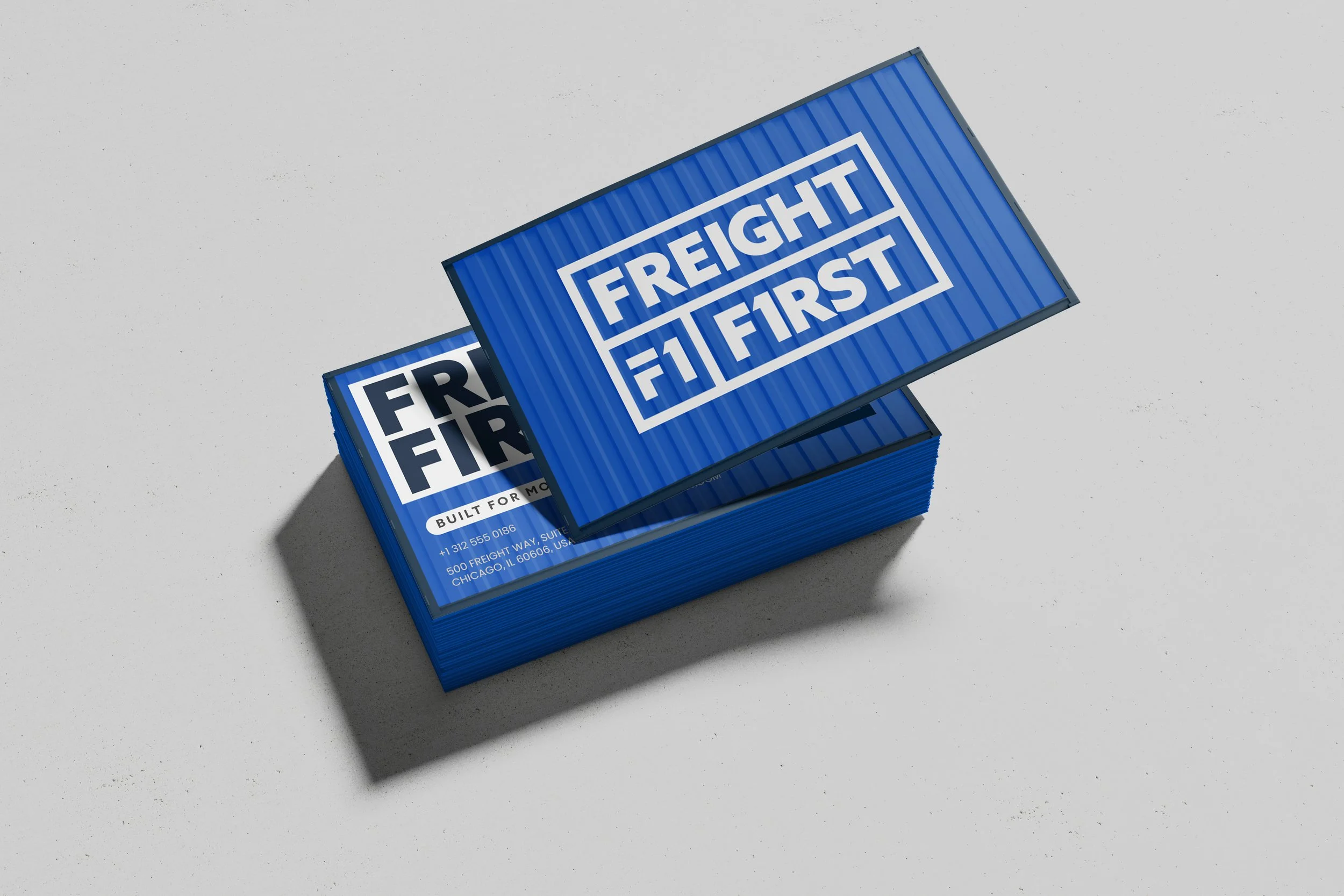
Brand Applications
APPLICATIONS
The brand was designed to work across marketing materials, digital platforms, and corporate collateral. The system allows the identity to remain consistent while adapting to different formats and use cases.
Final Execution
The final identity presents FreightFirst as a modern and dependable logistics brand. The system is clean, scalable, and designed to support future growth across digital and print environments.