Field Office Advisory
scroll


The Brief
Consulting brands often feel overly traditional or outdated. The challenge was to create a visual identity that feels sophisticated and modern while maintaining the professionalism expected in a corporate environment.
The Objective
The brand was designed to present Field Office Advisory as a modern consulting firm with a strong, professional presence. The identity focuses on typography, spacing, and restrained color to create a polished and credible visual system.
LOGO DEVELOPMENT
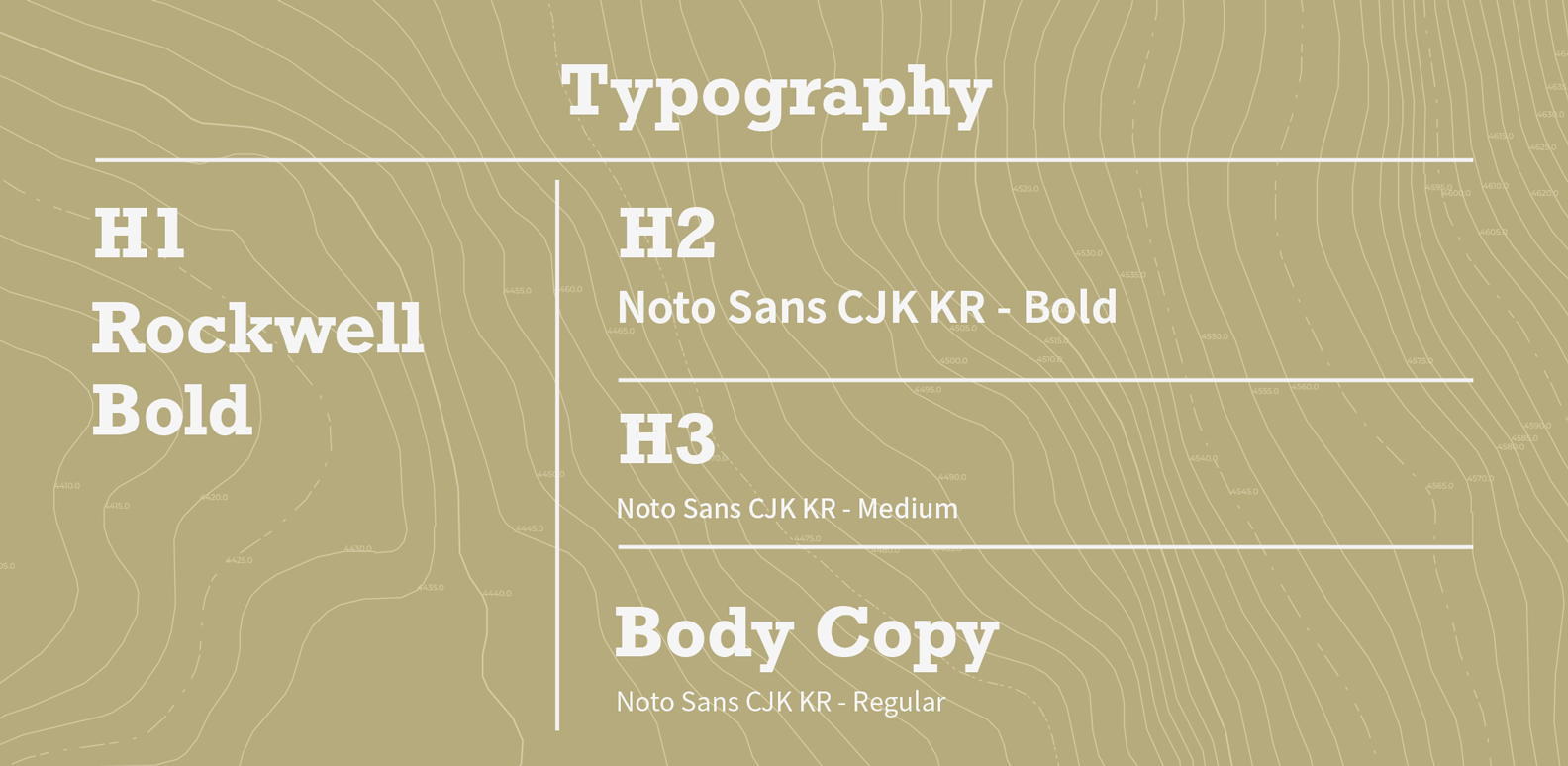
The logo was built using clean typography and balanced spacing to create a confident and structured mark. The design avoids unnecessary decoration, focusing instead on clarity and precision.

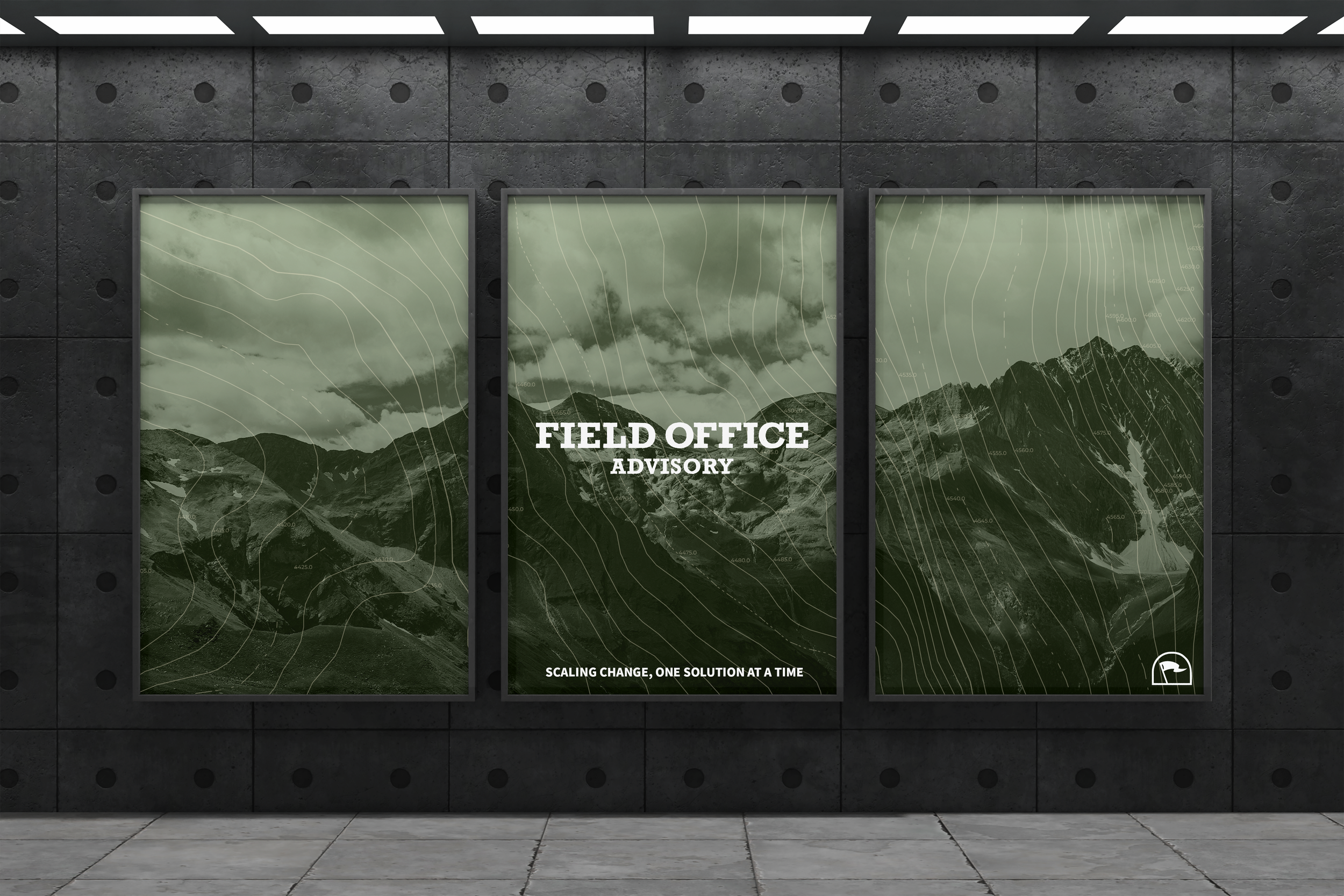
BRAND SYSTEM
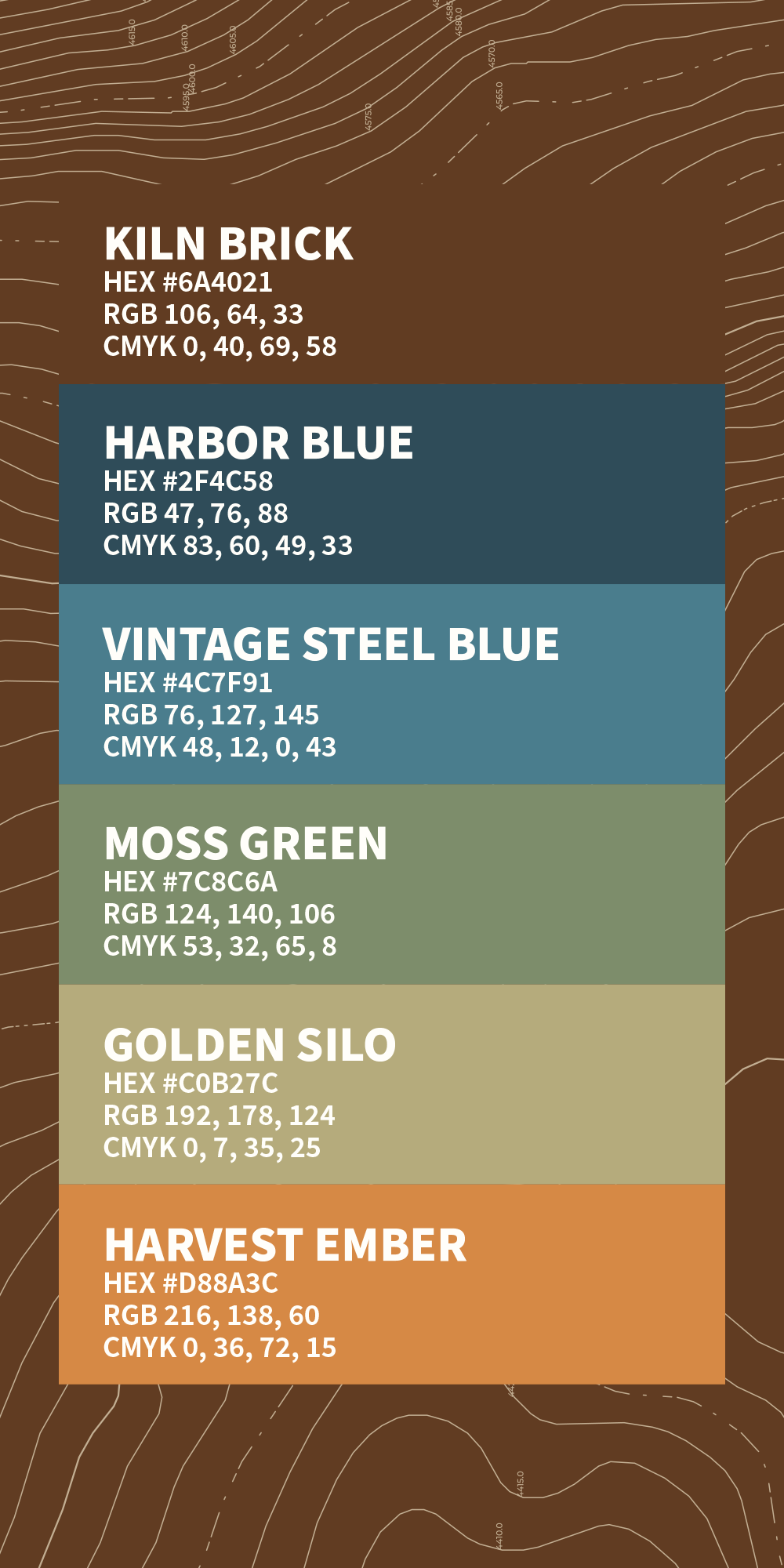
The identity uses a high-contrast color palette and strong typography to create a consistent visual language. The system was designed to work across digital, print, and environmental applications.
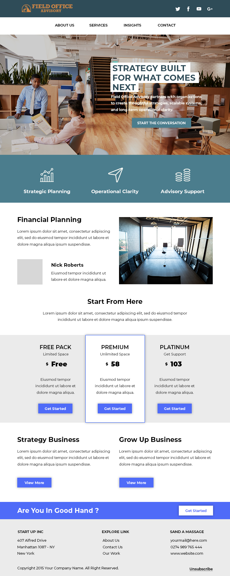
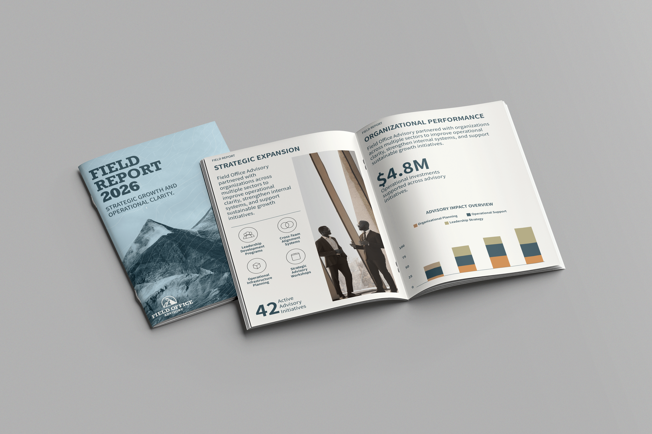
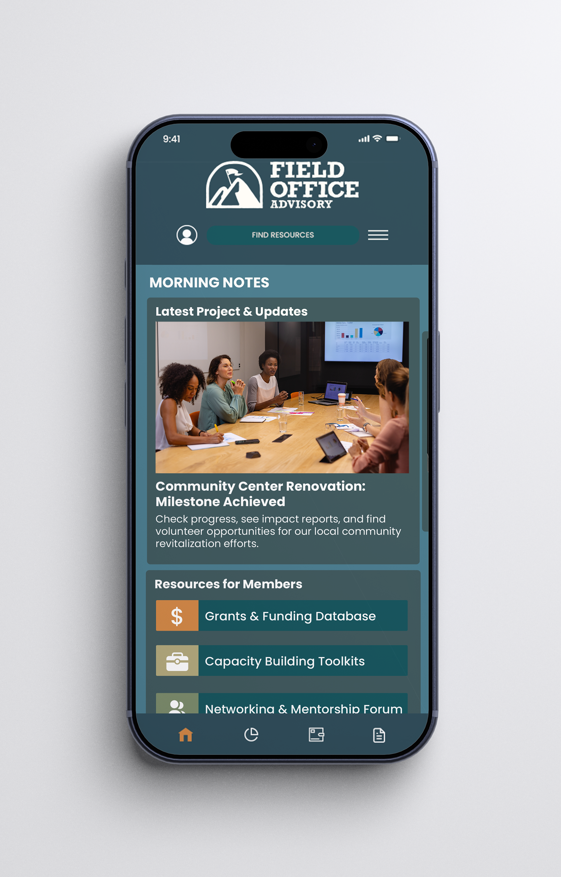
APPLICATIONS
The brand was designed to support corporate communications, including presentations, reports, and digital materials. The system allows the identity to remain consistent across different formats.
Result
The final identity presents Field Office Advisory as a professional and modern consulting brand. The system is clean, structured, and designed to scale across corporate and digital environments.